19 Ecommerce Case Studies You Need To Steal From

You’ve heard it before - always be testing.
But if you’re running an eCommerce business then the tasks of analyzing your site data and identifying leaks in the funnel usually get pushed to the bottom of your to-do list. Let's face it, you’ve got 97 other things you SHOULD be doing today.
So with that in mind, we've pulled together the following 19 real-world eCommerce lessons to help you cut straight to the chase in implementing some simple solutions to increase your online sales.

Growth Marketing Hacks for 2022
We share how we grew from 4-figure to 6-figure traffic in just one year.
In a hurry? Here are some eCommerce studies you need to steal from:
- How to improve Conversion: Envelopes.com achieve 40%
- How to improve Communication: Budapester increased mobile conversion by 29%
- Make small changes: Edible Arrangements increases same-day sales by 8%
- Make product benefits clear: Amerisleep increased checkouts by 13.9%
- Reduce website friction: Company Folders increase conversion by 68%
- Try cross selling products: Furniture retailer increased its AOV by 4.6% in 41 days
- Reduce clutter and distractions: Taloon.com ditched social buttons
- Use influencers to reach customers: Gwynnie Bee saw 5.85% CTR from Youtube influencer
- Reduce risk of purchase: Express Watches provides authenticity stamp
- Use events to drive sales: eCommerce companies saw a 27% spike during football world cup
- Remove distractions: Underwater Audio bump sales by 41%
- Get customers to take the next step: Kettlebell Kings’s takes advantage of user generated content to drive sales
- Use comparison data: Paperstone took out their competition with data
- Test and measure results: MVMT generated $90M in revenue in five years
- Find alternate channels: ECCO Shoes decreased customer acquisition costs by 14%
- Move past the product: Away generated $125M by standing out
- Drive inbound through content marketing: Bavarian Clockworks reached $1m in sales
- Build loyal engaged followers: Frank Body hit $20M in annual sales
- Be relevant to your customers: Society Socks improved survey response rate by 200%
19 eCommerce Case Studies to Double Your Sales
19 eCommerce case studies you need to learn from.
[eCommerce case study #1] How to improve Conversion: Envelopes.com achieve 40%
A common eCommerce problem is prospects exiting the page before completing their order. As consumers, we've all done it before. So the team at Envelopes.com wanted to see if they could “rekindle the flame” and land some sales from hot leads using target followups. These are visitors who created an account and put an item in their shopping cart, so we can see some real intent to purchase at some stage down the track.
The Envelopes.com team were confident that sending targeted follow-up emails generally resulted in sales but weren’t sure of the best timeframe to send them. So they tested out email sends at two alternate time lapses post cart abandonment; the first group sent the following morning at 11 a.m. and the second group 48 hours post cart abandonment.
The emails sent at 11 a.m. the following day delivered:
- an open rate of 38.63%
- a click-through rate of 19.54% and
- a conversion rate to a sale of 27.66%
The emails sent after 48 hours delivered:
- an open rate of 38.01%
- a click-through rate of 24.71% and
- a conversion rate of 40.00%
Although sending these emails on the following day post cart abandonment had a slightly higher open rate, the most important figure, conversion to sale was significantly lower.
Take home message
Send a follow-up email to people who abandon their carts, if you’re not already doing it. Though Envelopes.com found that 48hrs later was the best performing time, a different cadence and time lag may work better with your customer base, so test out multiple alternatives. If you're looking for some assistance on the creative messaging front, we have included the exact email creative used by Envelopes.com here:
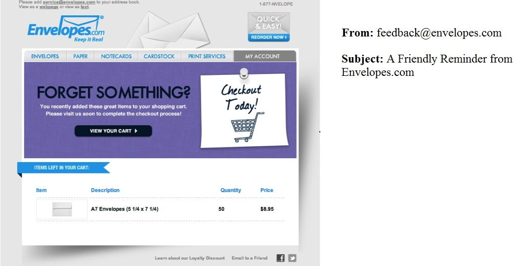
(Envelopes.com Reminder Email 1)
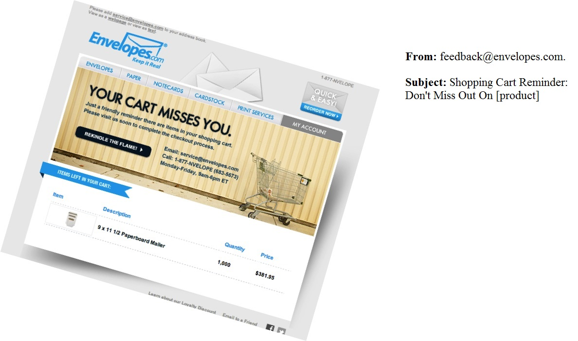
(Envelopes.com Reminder Email 2)
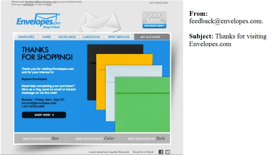
(Envelopes.com Reminder Email 3)
[eCommerce case study #2] How to improve Communication: Budapester increased mobile conversion by 29%
As anyone in the eCommerce realm can attest to, it can be pretty disheartening when a major influx in traffic doesn’t lead to an equally major spike in sales.
Unfortunately, that’s exactly what happened to German luxury fashion retailer Budapester a few years back.
Astoundingly, the brand’s website had been seeing hundreds of thousands of visitors each month—but its conversion rates were absolutely abysmal. The problem was even worse on mobile, where Budapester’s conversion rate was less than half that of its desktop alternative.
Upon realizing something needed to be done, the company’s first order of business was to communicate its unique selling propositions and other offers and policies more clearly to its visitors. This meant displaying information regarding free delivery, shipping options, and product availability prominently within its individual product pages:

(Budapester website | Source)
Along with this, Budapester also tweaked its site’s header—specifically, decreasing the logo’s size, and adding the above-mentioned info at the very top of the page. Again, this made it much easier for visitors to learn about these policies and offers right away.
Finally, the team also tweaked the appearance of its shopping cart page. From this...
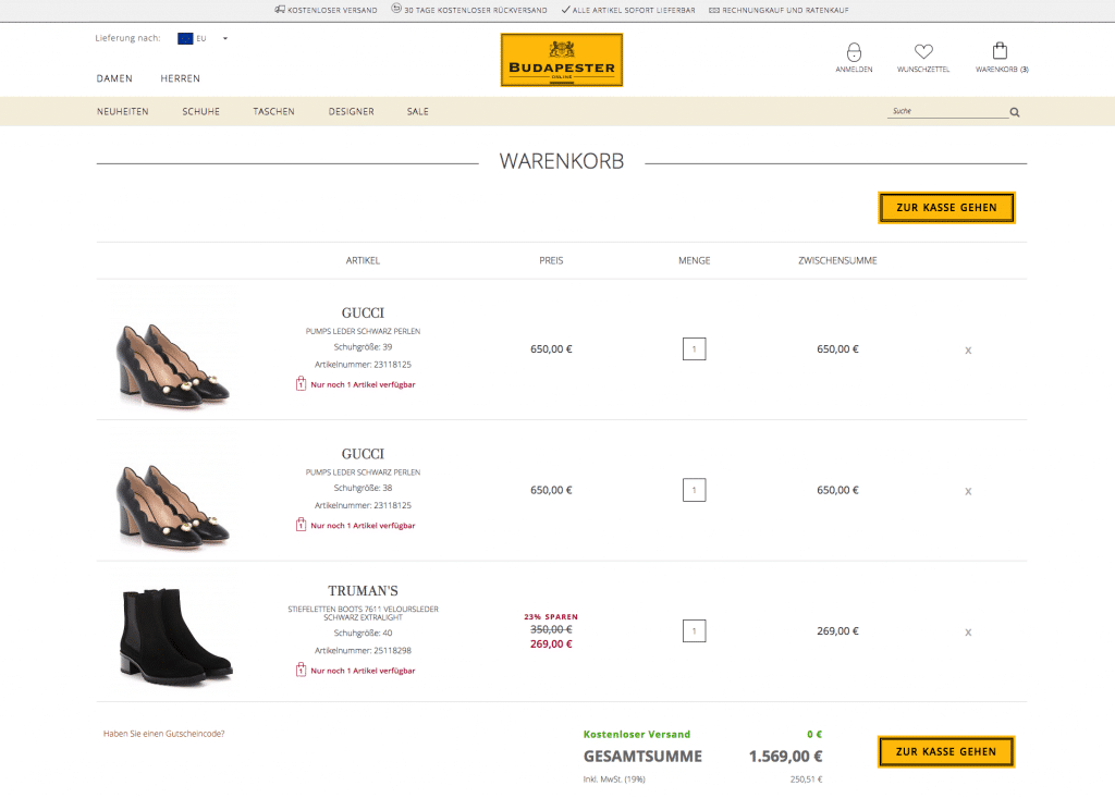
(Source | Budapester shopping cart – Before)
To this:
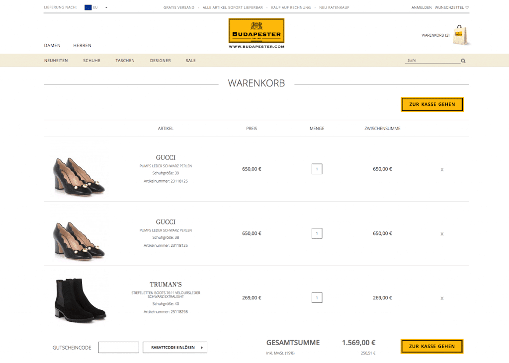
(Source | Budapester shopping cart - After)
Once more, the above information is now prominently displayed to the consumer—this time in two ways. In addition to the change to the header, the website now displays the company’s offer for free shipping in a green font that stands out at the bottom of the screen.
The end result of Budapester’s efforts, as Growcode explains:
“Its overall conversion rate increased by 12.5%, with its mobile conversion rate going up by nearly 30%. All in all, this equated to an additional 120,000€.”
Take home message
There are three main lessons to take away, here:
Firstly, it’s essential that you communicate your value to your potential customers in a clear and concise manner. If you offer something of value—say, free shipping on orders over $100—but you don’t tell your visitors about it...how are they supposed to know?
On the other side of this, you want to avoid including redundant or unnecessary information anywhere on your eCommerce website. Not only might this be distracting to your visitors, but it also takes up physical space on your site that could have been put to better use.
Finally, it’s worth pointing out that optimizing your site might not mean you need to do a complete overhaul. As was the case with Budapester, a few tiny, seemingly insignificant tweaks can be all your site needs to start generating a massive amount of conversions.
[eCommerce case study#3] Make small changes: Edible Arrangements increases same-day sales by 8%
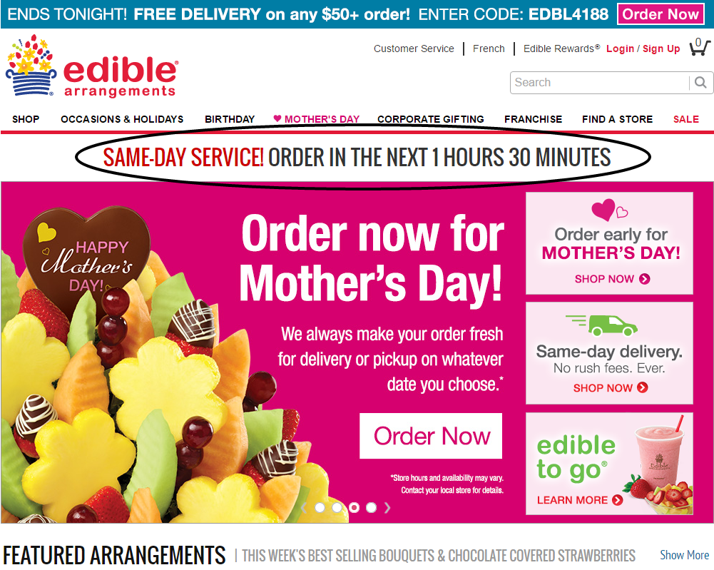
Edible Arrangements had a fairly typical marketing challenge. They offer customers a same-day delivery option (and have done so for years) but people weren’t taking advantage of the offer because they didn’t know about it.
To educate customers about this option they significantly increased visibility with a large banner in an extremely prominent position on the homepage, just below the navigation bar. This created urgency around the offer by featuring a countdown timer to the deadline for same day delivery. It was impossible to miss or misunderstand.
(Edible Arrangements website)
The result of this simple countdown feature? An increase in same-day sales by 8%!
Take home message
You don’t need a new product to promote something. People might not know about a product or service you already have in play, so by increasing visibility to your existing audience, you may be able to snap up some quick wins. As a side note on this particular example, creating some urgency is always a good sales strategy. Encourage your audience to act now, instead of later (or never).
[eCommerce case study #4] Make product benefits clear: Amerisleep increased checkouts by 13.9%
Online mattress retailer Amerisleep had a problem that was quite similar to Budapester’s:
The company was seeing a ton of traffic on its website, but its conversion rates were nowhere near where the team would have liked them to be.
However, with the help of Growth Rock, Amerisleep decided to take a different approach to improving its website:
Rather than adding or deleting certain information, the team decided to focus on improving the messaging of the site’s copy—in a few ways.
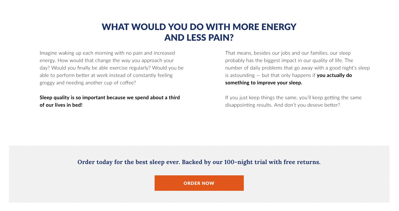
First, the team dug deeper into the true benefits their products provide their customers. In Amerisleep’s case, this meant going beyond promising “a good night’s sleep,” and instead focusing on how getting a good night’s sleep every night can be absolutely life-changing.
(What would you do with more energy and less pain? | Source)
Secondly, the team aimed to reduce hesitation among its visitors by addressing the importance of immediate action. Rather than discussing the above benefits in a more hypothetical manner, the site’s copy was adjusted to address the idea that every night spent tossing and turning is another night visitors will never get back.
Lastly, the team tweaked some rather ambiguous copy comparing Amerisleep’s products to its competitors’ and made it more clear.
Originally, the website had made claims such as “No mattress is more carefully engineered.” The problem, here, is that this could be interpreted as “No mattress is more carefully engineered—but many are engineered equally as carefully as ours.”
The new copy read:
“Our innovative and proprietary materials let us build one of the most comfortable mattresses ever”
Much stronger, no?
Again, these relatively minor tweaks had major implications for Amerisleep: That 13.9% increase in conversion rate we mentioned equated to millions of dollars in added revenue over the course of the next year.
Take home message
The overarching takeaway here is to write your copy with your audience in mind at all times.
This means:
- Ensuring they understand the true value your product will bring to their lives, and what it will enable them to do or accomplish
- Instilling a sense of urgency in your visitors, so they not only understand what they have to gain from using your product, but also what they have to lose by not using it
- Double- (triple-, and quadruple-) checking your copy to be absolutely certain it means what you want it to mean—and that your visitors will interpret it in the same way
[eCommerce case study #5] Reduce website friction: Company Folders increase conversion by 68%
Company Folders is an established business but had a website that their CEO admitted was “obviously last year”, which is putting it gently.
The main problem they wanted to remedy was their online quote function. This is a vital step in their marketing funnel, so making the process as smooth as possible was essential to ultimately driving more sales for the business.
This sounds a simple task but with over 15 million product combinations, the current quoting system was highly complex. Further to this, there was a very high rate of prospects dropping out of the form partially completed.
Intuitively they assumed that getting the form onto a single page would help get prospects through the process, but after surveying their best customers, they realized that a redesign was necessary.
They took a cumbersome single step process with lots of options and broke it up into a multi-step bite size process (pictured below). Doing this resulted in a whopping 67.68% increase in total quotes.

(Company folders website)
Take home message #3
Breaking down a complicated system into manageable smaller steps can help keep people focused and increase conversion. Though additional clicks can often be seen as new opportunities to lose customers, the Company Folders experience tells us that streamlining to shorter stepped forms is the way to go right now.
![Form 48 - Going D2C [Guide]](/files/images/pages/185/FULL-SIZE-to-Going-Direct-to-Consumer.webp?f=png&w=244&h=358&s=fit)
Going Direct-to-Consumer: The Definitive Guide
The definitive guide to going direct to consumer.
[eCommerce case study #6] Try cross selling products: Furniture retailer increased its AOV by 4.6% in 41 days
(Note: For this study, the company did not wish to be named, so we will, of course, respect their privacy)
Perhaps the only thing better than getting potential customers to convert in the first place is getting them to add even more items to their cart before converting.
Our anonymous furniture company knows this—which is why they had been aiming to cross-sell a conditioning kit to customers purchasing leather furniture from their online store.
While sales of the company’s “main” products (i.e., furniture) were pretty decent, sales of these smaller complementary items weren’t all that great. The main problem was that most customers simply weren’t even aware the company offered the conditioning kit in the first place. Basically, the only way they would be exposed to the product is if they were to actively browse for it on the company’s website.
(We should also note that the price of the item being cross-sold costs only about 6% of the company’s average order value, while still adding a ton of value to the main product. In other words, making the additional purchase should have been a no-brainer.)
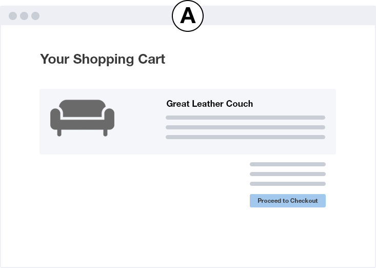
Knowing they needed to do a better job promoting such smaller-ticket items, the company decided to include a call-to-action directly within the shopping cart page when customers added an applicable big-ticket item to their cart.
So, the page went from looking like this:
(Your Shopping Cart | Source)
...to looking like this:

(Your Shopping Cart | Source)
Customers were then able to add the supplementary item to their cart with a single click (by clicking the plus sign), and could also visit the smaller item’s product page by clicking anywhere else within the pink bar.
The results were nothing short of amazing: As per Growth Rock’s data, the company’s average order value had increased by $55 (4.6%) in only 41 days. This equates to an additional $180,000 in monthly revenue!
Take home message
The first takeaway, here, is that successfully cross-selling relevant items that add value to your bigger-ticket items (and that add value to your customer experience) can have a major impact on your overall revenues.
But simply offering such supplementary products isn’t enough on its own. You also need to promote these items specifically as supplementary to the more valuable and expensive items you offer.
(For example, it’s more likely that consumers visiting a furniture eCommerce site will purchase leather cleaner if they’re in the market for leather furniture. That being the case, you’d want to focus on promoting the product specifically to these individuals.)
Going along with this, you also need to present your cross-sell offer at just the right time to get your customers to bite. Here, the company did so as visitors showed a high probability of making a large purchase — a prime moment to add extra value to their overall experience with the brand.
[eCommerce case study #7] Reduce clutter and distractions: Taloon.com ditched social buttons
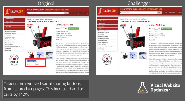
Taloon.com got caught up in the trend towards social proof, with "Like” and "Share“ icons on their product pages. However, they noticed unusually low conversions on pages with those social sharing buttons.
To test what was going on they created two variants of the same page with and without the social share icons.
(Taloon.com website)
They assumed that by de-cluttering the page, it would keep customers focused on the task at hand - checking out.
The results?
“Pages without social share icons saw an improved “add to cart” click-through by 12%”
Take home message
Just because everyone else is doing it doesn’t make it right. Always put yourself in the mindset of your customer, and keep them focused on the main task you want them to complete. Declutter pages with unnecessary actions to focus on making the sale.
[Ecommerce case study #8] Use influencers to reach customers: Gwynnie Bee saw 5.85% CTR from Youtube influencer
By now, you’re probably well aware of how effective influencer marketing can be in spreading brand awareness and social proof, and increasing engagement among your target audience members.
A few years ago, rental clothing e-retailer Gwynnie Bee realized this exact same thing. While the team had experienced a decent amount of success using a number of other marketing strategies (such as Facebook Ads), they knew they could be generating a lot more business than they were.
So, the company partnered with Reelio to get the ball rolling.
Working with Reelio, Gwynnie Bee began digging through YouTube’s massive database of influencers in search of those who aligned with the clothing company’s target market.
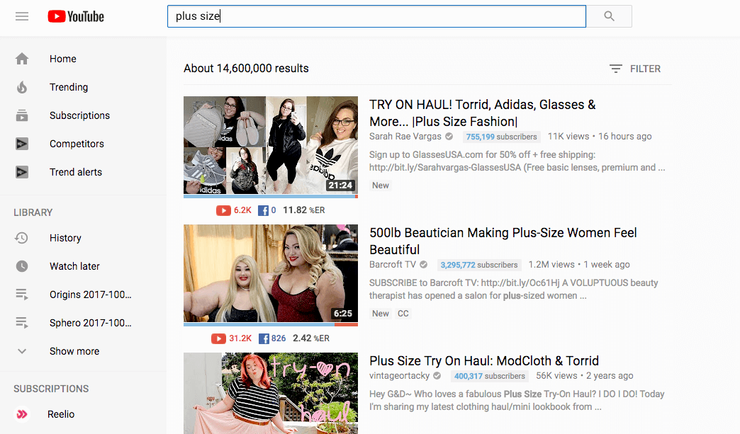
(Search results for "plus size" on Youtube)
The team’s first order of business was to create a list of potential candidates who fit the “surface-level” characteristics of their target market. This meant finding influencers who were female, aged 18 or older, and who typically wore clothing of sizes 10-32.
Now, here’s where Gwynnie Bee diverged from the “typical” path most brands take. Rather than looking specifically for individuals who often worked with other fashion companies, GB also considered those whose audience overlapped with their own. This meant looking at influencers who create content related to more tangential topics, such as lifestyle, accessories, food, and more.
The team then developed guidelines for their chosen influencers, which enabled them to create content that was authentic and non-scripted—but that also aligns with Gwynnie Bee’s overall marketing goals, as well. In addition to creating content to be presented on the influencer’s channel, GB’s influencers also created a virtual “closet” on the brand’s website to showcase the specific items they loved most.
The results of Gwynnie Bee’s influencer campaigns were...well...pretty darn good. While the average click-through rate of all influencer campaigns hovers around the 2% mark, GB’s campaigns saw a CTR of 5.85% — nearly three times the average.
Take home message
If you’re just getting started with influencer marketing, the main thing to focus on is finding content creators with an engaged audience full of consumers who align in some way with your own target market. They don’t have to overlap entirely, but you, of course, want to be sure that the people who end up seeing your products will have a genuine appreciation for, and interest in, your brand.
As far as content creation goes, you’ll want to provide your influencer’s with almost completely free rein in order to ensure authenticity. This will communicate to your influencer’s audience the idea that the influencer actually uses your products, and aren’t simply promoting them because they’re getting paid for it.
Finally, you might also consider inviting your influencers to create content on your channels as well as their own platforms. Again, this will prove to their audience that they truly are superfans of your brand who actively engage with everything your company has to offer.
[eCommerce case study #9] Reduce risk of purchase: Express Watches provides authenticity stamp
This is a classic problem for online stores; Do you boast the lowest price or the most authentic products?
The team at Express Watches were debating whether to communicate a ‘lowest price guarantee’ versus a stamp of authenticity on their website. They tested variants with both, each telling a different story about the clientele: bargain hunters vs aficionados. The results were pretty surprising.

(Lowest prices vs highest authenticity)
By labeling the site with a badge of authenticity, Express Watches saw an increase in online sales of 107%. A huge differential from the price based messaging, simply from a little seal of authenticity.
Take home message
You may think you know what your audience wants, but testing out some alternate value proposition could surprise you.
[eCommerce case study #10] Use events to drive sales: eCommerce companies saw a 27% spike during football world cup
The Soccer/Football World Cup is not only the most-watched sporting event on television of the 21st century – it is the most-watched event of any kind, period.
Needless to say, such an enormous audience makes for some major opportunities for eCommerce companies all over the world.
Of course, it also made for heft competition for brands operating in niches like sporting goods, clothing, and memorabilia.
As SEMRush explains, the brands that came out on top were the ones who:
- Increased their presence on the right channels (specifically, social media),
- Adjusted their ad copy to target soccer fans from specific nations (e.g. whose teams were making a run for the World Cup)
- Developed relevant and valuable offers to address time-sensitivity (e.g. fast and free shipping to ensure orders were received before the Wolrd Cup had ended)
The opportunistic initiatives led to some MASSIVE revenues for eCommerce companies. In Brazil, eCommerce purchases spiked by $16.6 BILLION, or 27% above the average. After Germany ended up winning, German-based eCommerce activity increased by a whopping 75%!
Take home message
First and foremost – and this goes any business, online or brick-and-mortar – you need to recognize an opportunity when it comes up and strike when the iron’s hot.
With this in mind, it’s worth noting that Brazillian-based eCommerce activity dropped by 17% immediately once the national team was eliminated from the tournament.
As far as recognizing these opportunities, you’ll want to keep an eye on upcoming events – be it a sports tournament, music festival, fashion show, etc. – that relate, in some way, to your brand’s offerings.
The goal is to “piggyback” off of the hype created by these events and market your products to those who are attending or engaged with the event in some way or another.
There are two main ways to go about this:
You might simply do as the brands mentioned above did, and ramp up your marketing initiatives throughout the timespan of the event, or, if possible, reach out to the host of the event to see if they’d be interested in partnering up in some way. This might mean sponsoring the event (in lieu of upping your ad spend) or even setting up a pop-up shop at the actual event

19 eCommerce Case Studies to Double Your Sales
19 eCommerce case studies you need to learn from.
[eCommerce case study #11] Remove distractions: Underwater Audio bump sales by 41%
Underwater Audio had a problem with visitors who were in the middle of their sales funnel, researching specific products but then dropping off at the comparison page. When they noticed this leak they decided to get to the bottom of it.
Here are the old and new versions of the page. At first glance, they don’t look too different, but the devil is in the detail.
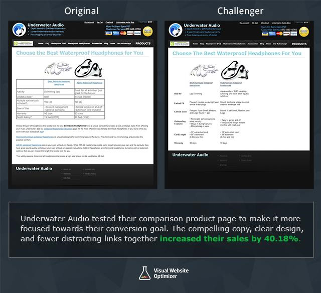
(Underwater Audio website page comparison)
The original one was a bit more cluttered with the table formatting breaking up the flow of information. To test what the problem was, they redesigned the comparison page to make it simpler and more streamlined.
As their CEO said:
“The (rather) unattractive table had information in terse phrases organized in no particular fashion (activity, seal, size, features, warranty, depth). The paragraphs continued below the fold and essentially repeated the table, with only a few unique additions hidden in the text. In short, it was not the most engaging page!”
The new version did away with the data tables, streamlined the text, and put everything above the fold.
The result? The redesigned page had an increase in online sales of 40.81%.
Take home message
To quote Occam's Razor, “the simplest solution is often the best” and the simpler flow worked wonders for Underwater Audio. Find pages in your pipeline where users are dropping off and see how you can simplify them to focus your customers.
[eCommerce case study #12] Get customers to take the next step: Kettlebell Kings’s takes advantage of user generated content to drive sales
In yet another case of “x isn’t working as well as we thought, let’s try something else,” the owners of fitness equipment startup Kettlebell Kings switched to a more organic approach after realizing their Google Ads campaigns were costing the company way too much money.
The team’s main focus: Instagram.
Their initiative started simply enough, creating instructional content focused on teaching their audience how to get the most out of their workout sessions.
As engagement began to soar, the team also noticed that its customers had also begun creating their own content featuring Kettlebell Kings’ products—which led the company to begin using this UGC to their advantage.


