6 Must Haves for a Product Page that Convert
Whether you're a small business owner or an established eCommerce professional, having a solid online store is fundamental to reaching customers and driving sales.
However, simply having a website isn't good enough. Success in the highly competitive e-commerce landscape calls for creating eCommerce product page that is visually appealing, informative, and aspirational to persuade site visitors to make a purchase.
But with countless options and offers at their fingertips, what is the single largest factor behind consumer purchase decisions online? According to a recent survey by the payment service provider Paytrail, over 51% of online shoppers are influenced by the smoothness and ease of buying in eCommerce stores.
How convenient it is to buy a product has the most sway over purchasing decisions over other factors like free delivery (32%) and promotional campaigns (28%). Creating a clear and uncomplicated user journey is therefore crucial to boosting both sales and engagement.
If you want to know more about creating product pages that convert, you're in the right place!
In this article, we’ll share examples of some very persuasive eCommerce product pages you can take inspiration from.
We’ll also help you figure out how to choose the right eCommerce platform to support your efforts. But first, let’s understand what elements make a product page a conversion tool.
Headless Commerce: The Ultimate Guide
To stay competitive in today market, an omnichannel experience is mandatory and can only be achieved with a headless platform. With Core dna decoupled solution, you get the best of both worlds: A headless commerce with content preview and templates for a faster time to market.
On this page:
What Makes a Product Page Convert?
Unfortunately, there are no one-size-fits-all guidelines for creating product pages that persuade online shoppers to whip out their wallets.
However, there are product page details that can significantly boost your page's performance in influencing sales.
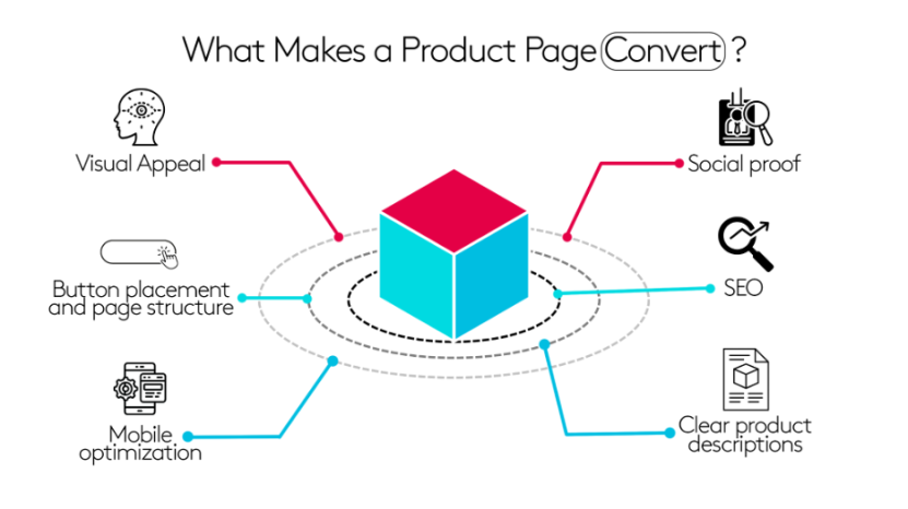
- Visual appeal: You only get one chance at making an excellent first impression, so don’t mess it up! First impressions can be game-changing, and a visually appealing design can draw the site visitors in and keep them engaged. It’s best to use high-quality images and videos that showcase your product from multiple angles, besides creating a clean and attractive layout that is easy to navigate.
- Social proof: Social proof is a powerful motivator to get consumers to make a purchase. According to Brightlocal’s Local Consumer Review Survey 2023, 98% of people read online reviews to evaluate local businesses, while 76% of consumers “always” or “regularly” check customer feedback before buying something.Your product pages should prominently feature customer reviews, ratings, and testimonials to highlight the positive experiences other customers have had with your brand. This makes potential consumers more likely to take the plunge and add your products to their cart.
- Button placement and page structure: To create an effective product page, you need to think like your audience. Consider your target audience’s psychology and how to set up a seamless customer journey for them.The placement and wording of your call-to-action (CTA) buttons, in particular, can impact your conversion rates. Use strategic placements and contrasting colors to draw attention to your CTA and make sure the language encourages users to take action.
- SEO: Optimizing your product page to rank higher on search engines can exponentially boost your online store traffic. The first organic result on Google is ten times more likely to receive a click compared to a result at the number ten spot.Best practices for SEO include incorporating relevant keywords in your page titles, headings, and product descriptions, using internal and external links, and having quick loading speeds.
- Mobile optimization: Mobile devices generate over 59% of global website traffic, so it’s essential to ensure that your product pages are optimized for smartphone viewing. Choose a responsive design when creating your product pages that adapt well to different screen sizes and load times. You must also take care of coding requirements that make your product page easy to navigate on mobile devices.
- Clear product descriptions: Use simple but striking language to describe your products and services to consumers. Focus on your unique selling points (USPs) - the qualities that set your offerings apart from others on the market. Make sure to include comprehensive details that lead potential customers to make a purchase decision, such as multiple images, product measurements, technical specifications, and usage methods.
Examples Of Great Product Pages Design
A great product page is defined by multiple factors - it is not just visually pleasing but also easy to navigate, informative, and can motivate customers to make a purchase.
Let’s look at some of the best examples of eCommerce product pages that successfully incorporate these elements:
1. Apple’s iPhone 14 Pro
Apple is known for its minimalism, both in its product designs and promotions. It is a brand quality that is well evident in its product pages as well.
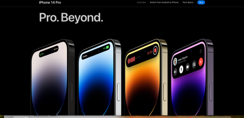
The iPhone 14 Pro product page presents the device in an aesthetically striking manner, with high-quality images and detailed descriptions of features and technical specifications.
The page highlights the USPs of this flagship product such as the 48 MP camera, the powerful battery, crash detection, and the design touch of Dynamic Island.
The page also includes a handy comparison tool allowing users to compare different iPhone models and identify the right one for their needs.
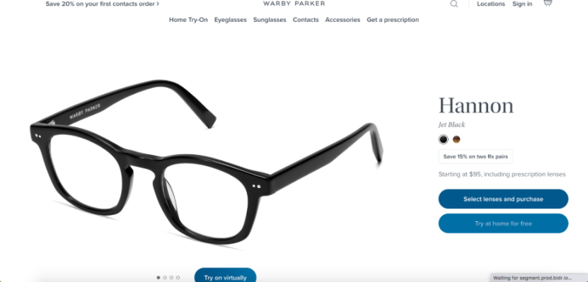
Warby Parker Eyeglasses
The product pages for Warby Parker eyeglasses are visually compelling, drawing consumers in with large, high-quality images of their glasses.
The page includes an innovative virtual try-on feature that allows customers to see how the glasses will look on their faces.
The product pages also include detailed descriptions of the glasses' features and benefits, lens types, and return and exchange policies. The pages look intuitive and seamless, providing all the necessary information required to pick a product.

How to Choose the right eCommerce Platform
Definitive guide to choosing an eCommerce platform.
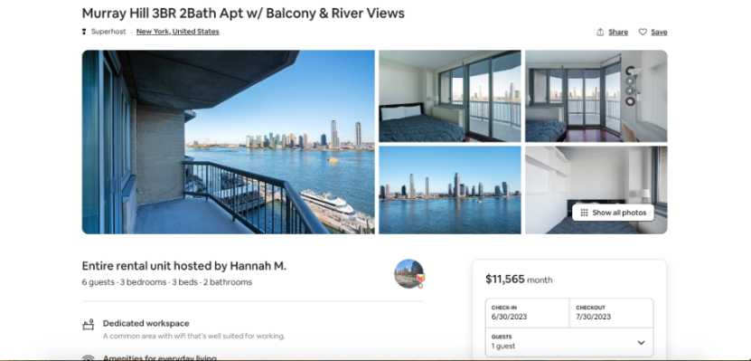
3.Airbnb Stays
Airbnb's product pages are designed to excite users, providing them with all the information they need to make a booking.
The pages feature stunning photography at the top to grab attention and follow it up with key features of a property like dedicated workplaces, free WiFi, free cancellation, and others.
Potential customers are also provided detailed descriptions of the property along with information about the location, amenities, and reviews from previous guests. Further, the booking process is simple and intuitive, with transparent pricing and rules.
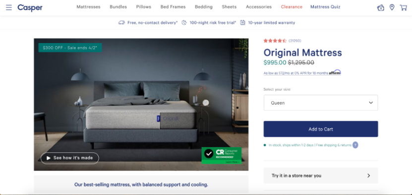
4. Casper
Choosing the right mattress can be confusing given the sheer variety of features, prices, and designs. But Casper knows how to make the process easy as a breeze for its customers.
The Original Mattress product page features simple yet detailed product descriptions and includes a video on the manufacturing process. This helps underscore the superior quality of the products and the effort that goes into designing and developing them.
Casper’s product pages also focus on gaining conversions through social proof. It has over 20,000 reviews from existing customers on its site to bolster trust among potential buyers.
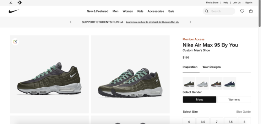
5. Nike
Nike's footwear product page include multiple high-quality product images, detailed descriptions, and specifications.
Apart from the traditional product images, the page also features pictures of real customers wearing the footwear as social proof and to show potential buyers how to style them.
Additionally, the page includes related products that the buyer may be interested in, such as caps and track pants, which can help increase sales.
6. Patagonia
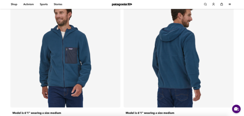
Patagonia's apparel product page create a positive user experience by providing clear product information while highlighting the company's values and commitment to sustainability.
The page designs showcase the brand's clean and modern aesthetic, while detailed pictures and videos invite shoppers to view the products from all angles.
The pages also include a cohesive size guide and mention the height of the models and what size they are wearing to help users identify which size is right for customers.
How to Choose an eCommerce Platform That Supports Your Efforts?
Creating well-designed eCommerce product pages is essential to deliver a positive customer experience. However, it can be challenging to get started on your own.
If you’re looking to increase conversions, you need to find an eCommerce platform that has your back. Make sure to spend time researching different platforms to find an effective and reliable one.
In general, your ideal eCommerce platform should:
Help you create a fast-loading website
Manage inventory seamlessly
Integrate with your existing tech stack
Assist with content reuse
Provide support and scalability
Core dna is a modern all-in-one hybrid CMS and eCommerce platform that does all this and more.
It helps you build top-of-the-line websites and applications and simplifies your digital presence by allowing you to manage your CMS, commerce, and marketing efforts on a single platform.
Moreover, it lets you create dynamic visitor experiences that easily integrate with your backend systems, enabling you to build digital solutions at scale.
Want to boost conversation and provide users with an excellent experience? Start your Core dna journey today and grow your digital presence lightning-fast!

eCommerce Marketing Trends
37-pages of the latest eCommerce & marketing strategies to succeed in the upcoming year!
From the rise of mobile shopping apps to the growth of social commerce and augmented reality experiences, there are many different ways that people shop today.


