The Hidden Metrics That Really Drive Website Engagement

Summarize with
Bounce rate and time-on-site don’t tell the whole story. If you want real website engagement, you need to dig deeper into what actually keeps users hooked.
Aside from the industry authority, there are things we can learn from these website: Simple and straightforward user experience, community generated content and a lot of it.
Creating an engaging and attractive website is a combination of different elements: design, ux, content, copy, load speed and more...
Key takeaways
- Design for your audience: Prioritize UI/UX, responsive design, and seamless omnichannel delivery to enhance user experience.
- Create value-driven content: Offer content that’s useful, authentic, and aligned with your audience’s needs and values.
- Use smart features to boost engagement: Leverage interactive site search, live chat, and engaging 404 pages to keep users involved.
- Humanize your brand: Show personality and openness to build deeper, more meaningful relationships with your audience.
In this article, we will give 10 tips and strategies to implement to increase engagement for your website.
How to improve website engagement?
Let's define website engagement: it isn’t just a fluffy term having to do with how users feel when they visit your site. It’s also a way to measure how users interact with your site, what actions they take on your site, and whether they ultimately end up converting into a customer.
When managing a website, you should be aware of your visitors website engagement metrics and actively work to improve them over time.
Here are some reasons why website engagement matters:

eCommerce Marketing Trends
37-pages of the latest eCommerce & marketing strategies to succeed in the upcoming year!
From the rise of mobile shopping apps to the growth of social commerce and augmented reality experiences, there are many different ways that people shop today.
UI and UX matter
Humans are visual creatures. The success of platforms like Instagram or Pinterest show our preference for curated and visually structured content. A good user interface design is the foundation of a good user experience. A good user experience starts by mapping out the user journey with your brand and making sure that each touchpoint is optimized in terms of design and goal.
UI & UX best practices to drive engagement
- Design with purpose
When designing your website or mobile app or any digital presence you wish to have, make sure it really embodies the spirit and passion of your business and your brand. Research has shown that people tends to connect more with brands that don't shy away from what their soul is.
- Know your people
We won't say it enough but the secret to success is knowing exactly what your target audience wants and needs. We all lay out hypothesis to create our designs or user experience but the best way is to A/B test your designs and customer journey and implement the ones with the highest conversion rate.
- Common UI patterns
Less efforts yet more efficiency. This is not about copying what everybody else is doing but realizing that if some elements look similar on several websites it's probably because they work and there is no need to reinvent the wheel. For example the placement of a CTA, or the shopping cart on the
- Visual hierarchy
Visual hierarchy relies on predetermined behaviors that are cultural influences on the way we consume information. In laying out your website banner images, content blocks, product images, call-to-action-buttons, etc., it’s worth following visual hierarchy best practices in terms of content structuring, images' size, contrast and the white space. Learn more here.
- Micro interactions
Micro-interactions are "little" design elements added to make the interaction with your website or product more fun, enjoyable and rewarding for the users. For example the swiping function to move to a different image or the error message when entering the wrong password. These little interaction have to be thought out to improve website navigation and create communicate with users in an effective and interactive way.
Responsive design and omnichannel delivery
In 2022, 58.16% of global web traffic originated from mobile devices. If your website is not designed with mobile in mind, you might be missing out on some substantial traffic and potential customers.
Responsive web design is a necessity that will boost your search results ranking and foster trust with your community. It will also help you create a stronger social presence and create a coherent customer journey across the different channels.
Yet, responsive design is not the solution to everything. Today, new digital channels are popping every year and all type of media can be used to engage with your target audience.
This is why having the right platform to support you creating, managing and sharing content across any and all possible channels: amazon alexa, podcasts, social media, brick and mortar digital displays, mobile etc.. is crucial.
Core dna digital experience platform - DXP - is the engine of powerful websites. It's an all in one content management system and Commerce platform with all the capabilities you need to deliver exceptional omnichannel digital experiences. Want to learn more? Check this out out article about Composable DXP.
Value driven content
Your content needs to add value to your customers. With so much content being created every day, brands should find their voice and own it.
Today's consumers have totally different expectations and want to see genuine, transparent brands that align with their values and beliefs. Consumers want to connect with the brands on a deeper level and that can only be achieved if brands open up. For example sharing behind the scenes snippets, talking about the creation process, being open to feedback and communication.
At Core dna, we defined value driven content as all the content we create to help marketers and developers succeed in their job. We might be a SaaS selling CMS and commerce solutions, but we understand that our customers scope if much larger than the platform and we want to share all the knowledge we have to help them thrive in their jobs.
Make 404 pages marketing assets
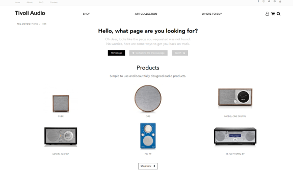
We all talk about the cool 404 pages we see. Being able to turn an error into something fun is a pretty cool skill but turning it into a converting page, that is genius. Using 404 pages as another way to direct users to related content if they aren’t able to find what they are looking for can help increase website engagement.
For instance, sometimes you may remove an item from your stock and this will result in a 404 page. Instead of having a page that says “Oops. This page is no longer here.”, you can direct users to similar pages or products.

Enable interactive site search
Even if you have a straightforward site navigation structure, it can still be difficult for users to find what they’re looking for.
That’s why you should always have site search enabled so users can find products without having to dig around on your site.
You can even level up your site search functions by adding interactive search, autocomplete, or faceted search to predict what users are searching for and make suggestions for related products. That way, even if a user is looking for a product that you don’t offer, you can direct them to similar products on your site.
Optimize your site search by following these best practices:
- Include autocomplete to help users find products even if they don’t know the exact name
- Allow search for misspellings of words/products
- Use AI and merchandising to suggest similar products to users to maximize sales
- Make sure search box is visible on all types of devices
- Include images, videos, and text results
- Turn frequently asked questions into a stand-alone FAQ page
Integrate live chats & chatbots
Websites glitch out, users get frustrated, the checkout page freezes, and other things can go awry. These mini disasters can be resolved quickly when you provide one-click-away customer support when and where they need it.
Again, leaving users to spend loads of time searching your site for support does not create a positive user experience. Instead, you can provide convenient resources to help them resolve their issues and get them to buy, fast.
With a live chat, you are able to provide 24/7 customer service, you reduce customer stress by getting them the help they need right away.
Not only will enabling live chat lead to happy users, but it decreases your chances of losing customers due to common frustrations. You can help them navigate the checkout process with ease, and even ask for a positive review in the process.

Headless Commerce: The Ultimate Guide
To stay competitive in today market, an omnichannel experience is mandatory and can only be achieved with a headless platform. With Core dna decoupled solution, you get the best of both worlds: A headless commerce with content preview and templates for a faster time to market.


