How to Awesome-ify Your Visual Content
Summarize with
Content, content, content. It’s all about creating content, which is why we’re all pretty much drowning in it right now. Over the last decade or so, we’ve experienced an explosion of online content unlike anything the world has ever seen. It’s hard to wrap your head around the fact that billions of pieces of content are published on a daily basis, with a large proportion coming from social media.
On the other hand, human attention spans have been decreasing—apparently to the point where we’re no better than goldfish.
That’s the real challenge for marketers and individual brands alike. The constant battle for user engagement has become more fierce than before, making content quality and relevance critical to the success of any online effort.
The end result is that most of the content online goes relatively unnoticed.
In a recent study by Moz and BuzzSumo, a randomly selected sample of 100,000 Facebook posts showed that over 50% received 2 or fewer interactions (likes, shares, and comments). Furthermore, over 75% of these posts had zero external linking domains.
One of the main reasons for this shocking lack of engagement is the proliferation of low-quality content, which is way too easy to create. But it’s not just the poor quality content producers that are suffering from content shock. Many of the more exemplary content producers of our time are also experiencing a reduction in average engagements per post:
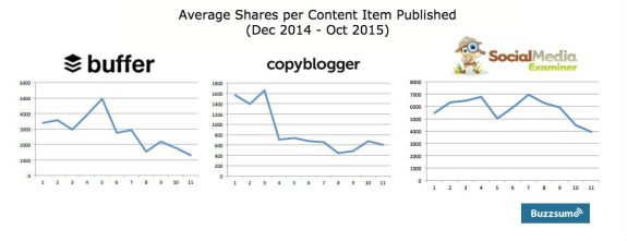
So it all comes back to the fact that we are consuming more content than ever before, in more mediums on more devices and our attention spans are diminishing! The need for “scannable” content that’s easily consumable is more pressing than ever. We’re bombarded with words every single day and no longer have the time and/or patience to read all the content we want to consume.
The solution to the problem? More visuals, fewer words.
On this page:
Why Visual Content?
The vast majority of all human communication is non-verbal, and this also holds true to how our brains process information. The reason for this is simple, our brains process visual information infinitely faster than we do with words.
Here are just a few stats that show how visual humans really are:
- 93% of all human communication is visual. (Source)
- Our brains process visuals 60,000 times faster than we do with text. (Source)
- Visuals with color increase willingness to consume a piece of content by 80%. (Source)
- Content with relevant images get 94% more views than those without.
But the use of visual content is nothing new. Since we’ve figured out its importance, everyone’s been jumping on the visual bandwagon, intending to make their content more appealing. So once again it’s gotten to the point where only quality content succeeds.
If you want your visuals to gain traction, you have to make them awesome so they stand out from the clutter.
Tips to Make Your Visual Content Awesome
Visual content type #1: Photos
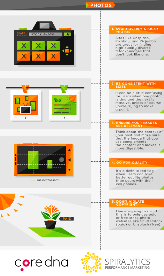
Tip for photos #1: Try to avoid overly ‘stocky’ photos
This might be difficult to achieve, especially if you’re not a professional photographer with a large bank of your own photos or just a marketer with a large bank (budget)! However, you can try to avoid using stock photos that you’ve seen elsewhere a million times. Go for the more unique options, they’ll do a better job of catching your audience’s attention and making your content appear less generic.
Tip for photos #2: Be consistent with sizes
When you’re complimenting your post with a number of photos, try to make them the same size for consistency purposes. It can be a little confusing for users when one photo is tiny and the next is massive, unless of course, you’re trying to make a point.
Tip for photos #3: Ensure your images are relevant
There’s nothing worse than seeing a completely irrelevant image on a blog post. It’s both confusing and an unnecessary waste of space. Think about the context of your post and make sure that the image that you use complements the content and makes it more digestible.
Tip for photos #4: Go for quality
Low-resolution images are a real put-off for most users. It’s a definite red flag when users can take better quality photos than yours with their cell phones. If your images are high quality, users can see more detail, meaning that they’re more likely to spend more time looking at each image, which results in more time spent reading your post.
Tip for photos #5: Don’t violate copyright
You should only be using royalty-free images to build your content, whether they’re paid for or not. Know that you are violating copyright if you haven’t gotten express permission from the copyright holder to use the image. One easy way to avoid this is to only use paid or free stock photo websites like Shutterstock (paid) or Unsplash (free).
Visual content type #2: ‘Drawn’ Images (Graphics)
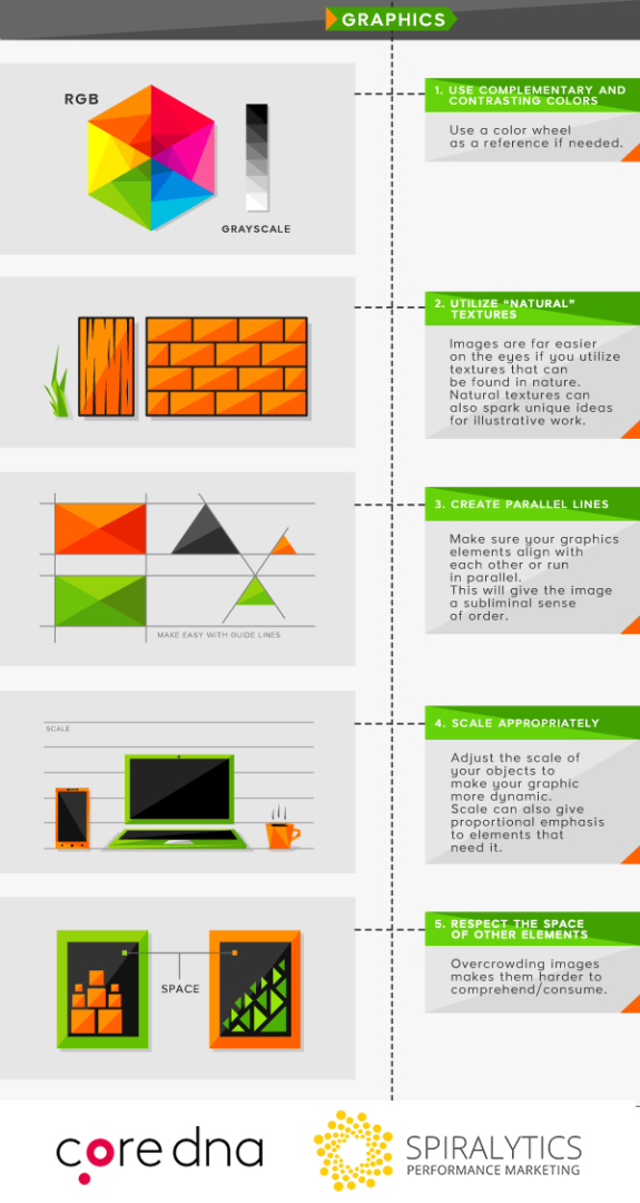
Tip for graphics #1. Use complementary and contrasting colors
The reason for using complementary colors doesn’t need much of an explanation. It improves the flow, making the user experience more coherent and less distracting. Contrasting colors on the other hand, make individual elements stand out more. This is really important when you’re trying to direct a user’s attention towards a particular section, like a call-to-action.
Tip for graphics #2. Utilize “natural” textures
Images are far easier on the eyes if they utilize textures that can be found in nature (leaves, flowers, tree bark, animal scales, waves, etc.). Not only are they visually appealing, they can also help spark creative ideas for your illustrative work. You can either choose to photograph them or apply your own drawing skills to emulate their designs.
Tip for graphics #3. Create parallel lines
It’s good to make sure that elements align with each other or run in parallel. Try to work out the rough geometries of any major shapes that you’re using and tweak them so they work well together. This sort of precise positioning infuses images with a subliminal sense of order, making them more pleasing to the eye.
Tip for graphics #4. Scale appropriately
Don’t be afraid to adjust the scale of your objects to make your graphic more dynamic. You can use method this to give depth to your graphic, making specific objects seem closer or further away. Scale can also give proportional emphasis to elements that need it.
Tip for graphics #5. Respect the space of other elements
Give your elements and their neighbors some space to breathe. Overcrowding images makes them harder to comprehend/consume. Every self-respecting graphic designer knows the importance of whitespace, so take a tip from the pros when they say that sometimes, less is more.
Visual content type #3: Videos
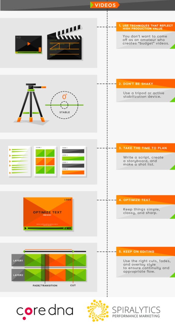
Tip for videos #1: Use techniques that reflect high production value
Needless to say, the quality of your video needs to be up to scratch because today’s users aren’t going to put up with bad lighting or a pixelated video. But what many video creators fail to address is the need for high sound quality. In almost every video, half of the message is depicted through sound, so ensure that your levels are correct and it isn’t distorted.
Tip for videos #2: Don’t be shaky
You’re probably not shooting the Blair Witch Project so be sure to use a tripod or active stabilization device. The perceived quality of a video is increased when there aren’t any harsh movements to distract the viewer.
Tip for videos #3: Take the time to plan
Think about what the purpose of your video is and how you want your target audience to feel when they watch it. Keep the end goal in mind by planning out the entirety of your video in progressive sequences. It helps to write a script, create a storyboard, and make a shot list so you know exactly what’s required and what your next steps are at any point.
Tip for videos #4: Optimize text
If you decide to use textual elements in your video, keep things simple, classy, and sharp. Use the right typeface to complement your video and avoid confusing your audience. Pick a font that represents the art direction and message of your video, and for heaven’s sake choose a color that contrasts against the background image so viewers don’t have difficulty reading the text.
Tip for videos #5: Keep on editing
You don’t need to have 3D graphics flying all over the place, but you should use the right cuts, fades, and overlay style to ensure continuity and appropriate flow. Trim the “fat” (unnecessary frames) to keep it clean and choose an editing software that best suits your needs. You should also spend some time in the editing studio mastering your audio before publishing.
Visual content type #4: Memes
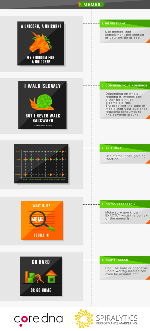
Tip for memes #1: Be relevant
Make sure you’re using memes that complement the context of your article or post. Using memes just for the sake of it won’t add any value to your content. The best memes are the ones that are relatable, so leveraging popular culture or “industry” humor can be a great way to get the attention of the right audience.
Tip for memes #2: Consider your audience
Depending on who’s reading it, memes can either be a hit or a complete fail. Try to reflect the type of media that your audience regularly consumes to find common ground. Memes generally depend on recognition for optimal results, so pick a theme or subject that your audience is familiar with and they’ll be sure to appreciate the effort.
Tip for memes #3: Be timely
It’s best to use a meme that’s gaining traction rather than losing steam. If you’re creating a meme that went viral five years ago, people won’t appreciate the outdated reference. Good timing can drastically increase the chances of your content going viral whereas bad timing pretty much ensures that your content will fall flat on its face.
Tip for memes #4: Do your research
Make sure you know EXACTLY what the context of the meme is. If it’s from a movie you haven’t watched yet, you should probably use something else. Be safe, not sorry. One way to reduce the risk of being out-of-context is to check out the meme in question on KnowYourMeme. It just might provide some much needed insight to prevent your brand from making a big mistake.
Tip for memes #5: Keep it clean
If you’re creating a meme for your brand, it’s best not to be rude or offensive. Share-worthy memes can even be inspirational, so remember that you’re not restricted to humor. However, tackling a potentially controversial subject with a meme can work wonders to make your meme go viral, though it could be in a negative context. With regard to this, it’s best to know where your priorities lie.
Visual content type #5: Animated GIFs
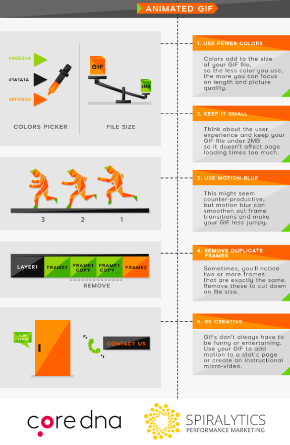
Tip for GIFs #1: Use fewer colors
Colors add to the size of your GIF file, so the less color you use, the more you can focus on length and picture quality. The maximum number of colors for most GIF creators is 256, but it’s best to stay below 64. Aim to use the fewest amount of colors possible without affecting the impact.
Tip for GIFs #2: Keep it small
No one wants to wait for GIFs to load. Think about the user experience and keep your GIF file under 2MB so it doesn’t affect page loading times too much. Not everyone has a high-speed connection and in 2016, anything more than two seconds will cause some viewers to lose interest.
Tip for GIFs #3: Use motion blur
This might seem counterproductive, but motion blur can smoothen out frame transitions and make your GIF less jumpy. If it’s an option, we highly recommend it. Motion blur will help smooth things out if you’re forced to reduce the number of frames to limit your file size.
Tip for GIFs #4: Remove duplicate frames
If you look closely enough, sometimes you’ll notice two or more frames that are exactly the same. Having the exact same frame will do nothing more than add to your GIF’s size so you should definitely consider deleting these to minimize load times.
Tip for GIFs #5: Be creative
GIFs don’t always have to be funny or entertaining. Get creative and use your GIF to add motion to a static page or create an instructional micro-video. The possibilities are endless!
Visual content type #6: Infographics
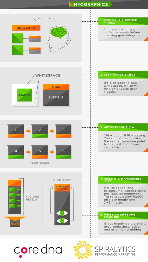
Tip for infographics #1: Keep your audience in mind
Figure out what your audience wants before creating your infographic. The ones that gain the most traction always meet their audiences where they want it most. Don’t be afraid to spread your creative wings, you’re not restricted solely to topics that are related to your brand. For instance, you could always do the socially responsible thing and create a public service announcement.
Tip for infographics #2:. Keep things simple
Infographics are meant to convert potentially overwhelming information into easily digestible chunks. You should keep in mind that they’re meant to make things easier to consume, so don’t complicate things unnecessarily. It’s also good to add whitespace, which will help emphasize your visuals and make each element stand out more.
Tip for infographics #3: Address the flow
Make sure that the information flows both visually and cognitively. Think about it like a story. You should aim to take the reader from one point to the next in a proper sequence. If you’re able to do this right, you’ll increase the chances of users reading the entire infographic and not stopping halfway through. More time spent on your page means more time to get your message across.
Tip for infographics #4: Make it a manageable size
If it takes too long to load, users will get annoyed. If it takes too long to consume, you’re risking the TL;DR phenomenon. There’s no hard and fast rule but you should try to stay below 8,000 pixels in length and 2MB in size. Like any other visual content, if it takes too long to load on the page, your bounce rates will definitely increase.
Tip for infographics #5: Write an awesome headline
Headlines are the first thing users read to gauge if your content is relevant to them. Great headlines are short, accurately descriptive, and attention grabbing. On social media, blogs, content curation sites, and just about any other channel, you’re constantly battling for user attention. Writing an effective headline works to stand out from the clutter and get that precious clickthrough.
Visual content type #7: Calls-To-Action
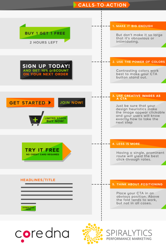
Tip for CTAs #1: Make it big enough
The CTA text, as well as the button itself, should be big and obvious enough for users to notice it upon glancing at a page. But don’t make it so large that it’s obnoxious or intimidating. A good rule of thumb is to make it big enough to be prominent while keeping it subtle enough so it doesn’t distract users from the rest of the content on your page.
Tip for CTAs #2: Use the power of colors
Although red, orange, and green tend to be the best performers, it depends on your site design. Contrasting colors work best to make your CTA button stand out, so if your website theme is predominantly red, you should try colors like green or yellow to make your button more obvious. It’s a good idea to test different colors to determine what works best for each situation.
Tip for CTAs #3: Take design to the next level
Generally speaking, CTAs that look like buttons give users the impression that they’re clickable, which is a good thing. But using creative images as CTA buttons can help to make things a little more interesting. Just be sure that your design heuristics make the image appear clickable and your users will know exactly how to take the next step.
Tip for CTAs #4: Less is more
Don’t give users too many options when it comes to taking the next action. Having a single, prominent route will yield the best click-through rates. For landing pages, this means removing your navigation bars and other irrelevant links that might cause users to detract from the primary goal of conversion. In most cases, one CTA button per page is your best bet.
Tip for CTAs #5: Think about positioning
Depending on the context, you should place your CTA in an obvious position. Above the fold tends to work, but not in all cases. Sometimes, placing your CTA in the middle or near the end of a blog post can produce higher conversion rates because readers have already shown interest by scrolling down the page before seeing the button. Like any other element, you should test different positions of your CTA to see which works best for each case.
Visual content type #8: Screenshots

Tip for screenshots #1: Create a sense of what it’s like to use the app
Users want to know about your app’s features and what it’s like visually. Simple sequences of standalone screenshots serve this purpose pretty well. Give an idea of what it’s like to use the app in the middle or at the end of a task. By doing this, you’ll give users a view of the bigger picture as well as what your app is capable of.
Tip for screenshots #2: Show the best screenshot first
Let’s face it, visual content has to be eye-catching. You’ve got that precious initial few seconds to grab a user’s attention so DO NOT save the best for last. Users expect a logical sequence of screenshots to show user flow and outline steps, but they’ll never get to that point unless your first image captures their attention enough to inspire further engagement.
Tip for screenshots #3: Keep captions short
Screenshots are meant to show, not tell. Don’t make the mistake of forcing users to read long captions, they’ll probably just get annoyed and move on. A single, short sentence is usually more than enough to get the message of the screenshot across. Of course, if the image is self-explanatory, you can definitely get away with not including a caption at all.
Tip for screenshots #4: Choose a single subject
This one element of your screenshot should grab attention and be the focal point of the image. Your subject can be a brand logo, prominent icon or in-game character. If it’s a particular aspect of the app you’re trying to highlight, try creating a magnified view of what users are supposed to pay attention to.
Tip for screenshots #5: Include your unique selling proposition
Always include your main selling point in your screenshot so your audience gets the most important message. Chances are, your app’s primary function will have alternatives and this will help with differentiating it from other similar programs. You can achieve this with a descriptive caption or a focal point that sums up the main benefits of the app.
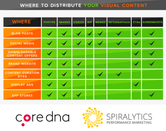
Where to Distribute Your Visual Content
Conclusion
There you have it, the top tips to create awesome visuals for your brand (or even if you just want to share a creative Snapchat message with your friends). To make things a little easier, consider utilizing one of the many free tools available that help design-newbies create stunning visuals:
- Pixabay – Nice resource for finding free images for commercial/personal use.
- Canva – Great tool for easily creating customized designs.
- MemeGenerator – The easiest way to create memes.
- Google Fonts – Perfect for experimenting with or finding new font designs.
- Skitch – An awesomely easy tool to create unique designs (only available on Apple Devices).
- Giphy – Find and create memorable GIFs in a few simple steps.
- ButtonOptimizer – Simple tool for creating customized CTA buttons (CSS and images).
Remember to brand your visual content, it’ll help boost awareness and help users remember to associate your brand with what they see, increasing the chance of recollection. Also keep in mind that context is everything, so don’t just use visual content because everyone’s telling you to, use it because it enhances the content consumption experience for your audience.
As a final reminder, take note that creation is just one chapter of the story.
No piece of content is ever successful without effective distribution and promotion, and that goes for text as well as visuals. No kingdom is complete without its queen. So if content rules the land, distribution is without a doubt his indispensable queen. Include meta-descriptions with all your visual content, it’ll help search engines decipher what’s shown and index your content more accurately.
If you’re just starting out with visual content creation, test a few different types to see which ones get the highest levels of engagement. After a while, you’ll come to understand what to focus on for the best possible results with your target audience. Once you figure out an effective strategy for creating visual content, your audience will show you their appreciation with more views, interactions, and conversions.


