35 Fatal eCommerce Mistakes We See People Make (Yes, Even You!)
Anyone who runs or has run even a mildly-successful eCommerce business can confirm: It’s not as easy as it seems.
While many business owners and seasoned managers mistakenly see eCommerce as a set-it-and-forget-it, get-rich-quick proposition, this couldn’t be further from the truth.
The fact of the matter is, the ones who do experience success in the world of eCommerce are those who:
- Know what a serious undertaking it is
- Continuously learn, grow, and improve on their past mistakes and shortcomings
Of course, to be able to learn from your past mistakes means you have to actually make these mistakes in the first place, right? Needless to say, this means you’ll need to invest a good amount of time, money, and energy into ventures that might not pay off all that well.
That said, we’ve compiled a list of the most common mistakes we see both newbie and experienced eCommerce site owners and managers make all the time so that you don’t run into the same problems in your own ventures.
Let’s get to it.
35 fatal eCommerce mistakes we see people make
If you’re thinking to yourself, “Whoa...thirty-five?”, you should know that this list is by no means comprehensive.
The truth is, there really is no finite amount of mistakes an individual (or company) can make when diving into the world of eCommerce. As Murphy’s Law says, “Anything that can go wrong will go wrong.”
Now, we’re not trying to dissuade you from digging into the world of eCommerce full on, or anything of the sort. On the contrary, we want you to be prepared for the potential bumps in the road you may face as you continue to grow your business, so that these minor obstacles don’t end up causing you to give up before you’ve even got started.
On this page:
Mistakes related to eCommerce platform choice
1. Developing your own CMS
Simply put:
If you’re not a highly-trained web developer, creating your own CMS from scratch is going to be near-impossible. Heck, doing so can be a nightmare even if you are an experienced developer.
As we’ll discuss throughout this article, a lot goes into running an eCommerce business; you don’t want to add to the pile by opting to create your own content management system. Aside from the fact that doing so requires in-depth programming knowledge, there’s also the fact that you might not exactly know what features your CMS needs to include in the first place.
That said, your best bet - at least for the time being - is to opt for an open-source or proprietary platform that will not only fit your current needs, but will set the bar in terms of what you’ll need from a CMS moving forward.
2. Choosing the wrong platform
Of course, not all open-source or proprietary content management systems are created equally, either.
As we said, you might not know exactly what you’re looking to get from a CMS - or how your needs may change as you begin to scale. Still, you don’t want to just pick one and run with it under the assumption that the differences between your choices don’t matter all that much.
The last thing you want is to get your site all set up on a given CMS only to realize the platform doesn’t offer a feature that’s vital to your operations. If that happens, you’ll essentially need to invest a ton of time, money, and energy into migrating to a different platform.
(And, of course, if you’ve entered into a contract or anything of the sort, you actually won’t be able to even make this change right away.)
All this being said, before you commit to a certain content management system, take a look at Core dna’s guide to choosing the right CMS for your company. While a lot goes into making the right decision, here, making the wrong choice can absolutely be fatal to your company.
3. Overlooking security
As the manager of an eCommerce business, you’re not only responsible for internal, company-facing data - you’re also responsible for your customers’ private information, as well.
Needless to say, you’re going to want any and everything having to do with your business to remain safe and secure at all times. And, while you never want to truly let this aspect of security slip to the backburner, you also don’t want to have to continually worry about keeping all this data safe all the time.
That said, you do want to ensure that your CMS of choice guarantees protection against security breaches and hacking attempts.
Make no mistake:
Failure to ensure the security of your or your customers’ data can cause major issues for your organization, and can ultimately sink your company’s reputation altogether.
Mistakes related to your homepage
4. No clear value proposition
Here’s the deal:
If visitors to your site can’t immediately figure out what you have to offer, they’re going to quickly click the “back” button and find what they need elsewhere.
Take a look at Uber’s homepage:
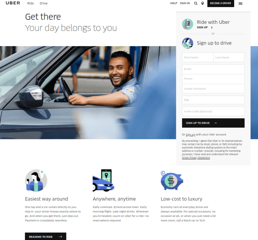
If you (somehow) didn’t know what Uber was, or what the company offered, a quick visit to their site gives you everything you need to know to get started - either as a passenger or a driver.
The main goal of your homepage is to quickly grab your visitor’s attention and convince them to dig deeper into your offering. If you don’t do it, your competitors will.
5. Poor design and copy
While design and copy are two different aspects of a homepage, they definitely go hand-in-hand with one another.
That is, excellent site design coupled with poor copy - or vice-versa - simply won’t be effective in terms of attracting and engaging your site’s visitors.
When we talk about “coupling” design and copy, here’s what we mean:
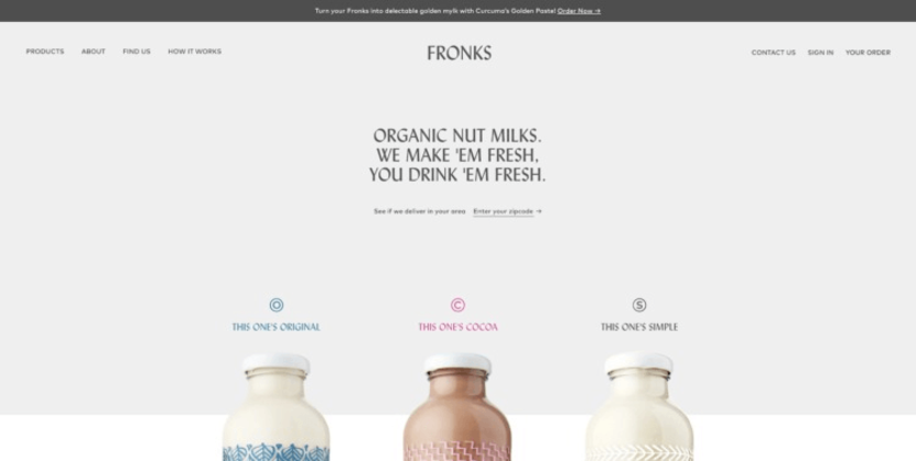
Design? Simple. Copy? Simple.
Of course, if your product is a bit more complex, so too should be your homepage copy and design:
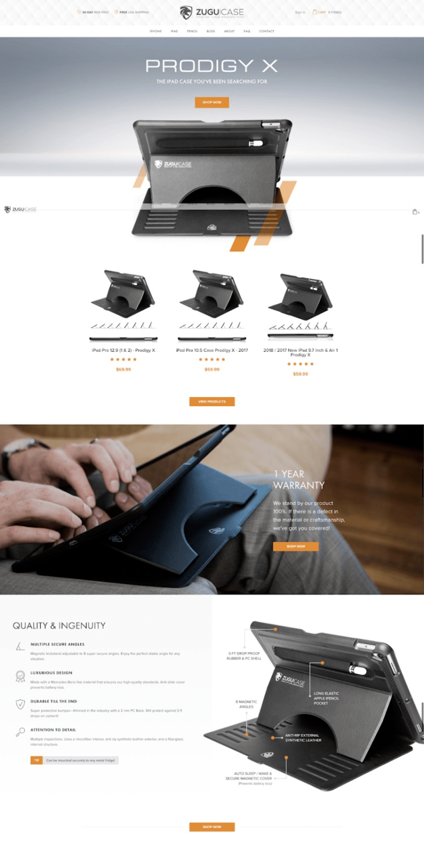
However, don’t mistake “complex” for “complicated”. We’ll talk about this a bit later on, but for now, just understand the importance of matching your homepage copy and design to your offering.
Recommended readings:
6. Poor mix of text, imagery, and video
Similarly to what we just said, you want to be sure to balance the amount of text, imagery, and multimedia included on your homepage.
Now, when we say “balance” we don’t necessarily mean that you should include equal amounts of text, images, and/or video; we mean you should provide the right amount of each as is expected by your target audience.
Take a look at this example from Azteca Soccer:

Being an athletic apparel retailer, Azteca focuses on providing high-quality images of its products directly on its homepage.
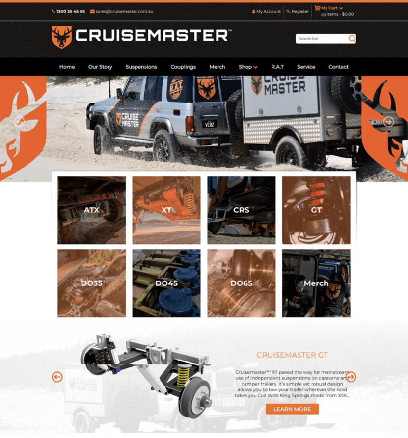
ATV accessory company Cruisemaster, on the other hand, provides a mix of text, images, and video on its homepage:
7. Poor navigation
Since your goal for your homepage is to get your visitors to check out the rest of your site, you need to make it easy for them to get where they want to be.
Take this screenshot of Home Science Tools’ homepage, for example:

While the homepage may be a bit cluttered, any visitor looking for a specific type of product will easily be able to get to the right category page.
The point, here, is that you do want your visitors to “click around” your site - but you want them to do so with a purpose. If they’re simply clicking around while trying to figure out where to go on your site, they’re almost certainly going to give up rather quickly.
Recommended readings:
8. Poor lead-capturing efforts
The nature of eCommerce is such that you’re unable to engage directly with visitors to your website if they don’t actively make moves toward conversion.
(As opposed to the case with brick-and-mortar stores, in which representatives can easily greet and engage with new customers as they enter.)
Of course, not everyone that visits your site is going to go on to make a purchase.
But that doesn’t mean you should just let them slip away forever. Rather, you want to capture as much information about your potential leads as you possibly can.
Whether you use lightbox overlays:

Or simply include a lead-capture form directly on your homepage:
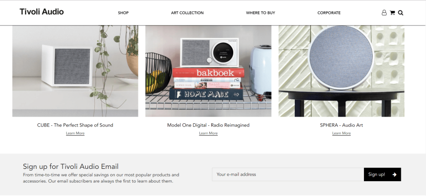
...it’s essential that you include some sort of lead-capture form on your homepage, so that those who aren’t yet interested in making a purchase - but are interested in learning more about what you have to offer - are able to engage further with your brand.
On the other side of things, having too many lead-capture forms on your homepage can distract - and annoy - your visitors, and will likely cause them to permanently navigate away from your site.
Recommended readings:
9. Technical glitches
This probably goes without saying, but your homepage (and the rest of your site) should be free of technical glitches and other such issues.
This means:
- Ensuring that every link on your homepage works, and directs visitors to the correct page
- Optimizing your site’s loading speed
- Ensuring your site is optimized for mobile devices
If any such glitches occur, it won’t matter how well put-together your site is otherwise - your visitors probably aren’t going to be around long enough to see everything else you have to offer.
Mistakes related to category pages
10. Not using category pages
We mentioned this above when presenting the example from Home Science Tools:
As long as you offer multiple products on your eCommerce site, you absolutely need to create separate category pages as appropriate.
(Think, for instance, how difficult it would be to find the right equipment on Home Science Tools if the site offered only a single page full of each item it offered.)
Kevin Strawbridge of Square L Group agrees:
“(One of the biggest mistakes eCommerce owners make is) failing to build a proper hierarchy and taxonomy for families of products at the onset…(and having) a lack of proper organization of information.”
As we’ll illustrate in the next few sections, not only do categories pages allow you to easily organize and present your various products to your visitors, but it also provides opportunities for you to provide additional information to keep your visitors educated and engaged with your brand.
11. Poor hierarchy
When grouping your products into categories, you certainly want to do so in a way that makes sense.
(As we said, the point of having category pages is to make it easy for your visitors to find the products they’re looking for.)
On the one hand, you don’t want to be too broad, as this defeats the purpose of having separate category pages in the first place. On the other hand, you don’t want to be too specific, since you’ll want each category to include more than one or two items.
Take a look at this example from Scentos Markers:

The hierarchy for these products is as follows:
Shop → Coloring & Writing → Markers
Within the “Coloring & Writing” section, there are a number of other subsections, including “Crayons,” “Colored Pencils,” and “Gel Pens.” For these products, there’s certainly a need to divide “Coloring & Writing” into multiple subsections, but there wouldn’t be a need to divide these subsections any further.
Since you know your products best, it’s up to you to figure out the best way to categorize each of them.
Recommended reading:
12. Poor design and copy
As with your homepage, your category pages need to attract and engage your visitors in order to get them to check out your actual products.
In fact, you can even use your category pages as a sort of FAQ page related to the products in question, as RevZilla does here:

Additionally, RevZilla also provides links to further reading directly on its category pages:

The takeaway, here, is that your category pages shouldn’t just be used to divide up your products - they should be used to add to your visitor’s overall experience with your brand.
Recommended readings:
13. Poor media mix
We don’t really need to say much, here, since we’ve already talked about this with regard to your homepage.
Again, just be sure to include the right mix of text, imagery, and multimedia as expected by your visitors.
Often, this comes down to the way in which your products are typically used. If, for example, your customers need to see your products “in action” before they make a purchase, you definitely want to include video on your category pages.
We’ll get more into that in a bit.
14. Overwhelming category pages
There’s a decent chance that, when you saw our examples from RevZilla above, you thought that it was...well...a bit much.
To be sure, there’s no need to go crazy in-depth on your category pages if your target customers don’t want you to.
Yes, you do want to use your category pages to provide additional info about the products showcased within - but you don’t want to drone on to the point that you bore your visitors to death. And you definitely don’t want to be so “in your face” that you annoy them, either.
To reiterate, your category pages should serve to:
- Organize your products appropriately
- Allow for easy navigation for your visitors
- Provide additional information to keep your visitors moving toward conversion
Mistakes related to product pages
15. Poor product description and info
This one’s a biggie.
Since your customers aren’t able to interact with your products before they actually buy them, it’s your job to explain to them exactly what it is they’re purchasing.
Now, depending on who you ask, your product descriptions should focus either on objective features and specifications, or on subjective benefits to the customer.
But, really: Why can’t you do both?
Stanley does:
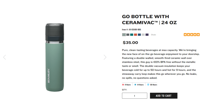
Read that description and tell us you don’t know exactly what it’d feel like to have those vacuum bottles.
That’s exactly what your product pages need to do.
As Justin Biddle of Staxoweb confirms:
“Never underestimate the importance of strong product data.”
Recommended readings:
16. Poor product photography
Going along with in-depth product descriptions, it’s also essential that you provide high-quality product photographs on your product pages, as well.
James Winter of AspireIQ (formerly Revfluence) has this to say:
“When people shop online, it can obviously be a challenge to see how the product might look in a real-life situation. Brands often struggle to show their products in a way that reflects what a potential customer might actually resonate with.”
Winter continues, saying that this shortcoming fails to “bring the product to life” in the eyes of the customer (who, again, can’t interact with the product until they buy it).
Typically, you’ll want to include the following on your product pages:
Studio photographs, such as the ones featured on Tivoli Audio:
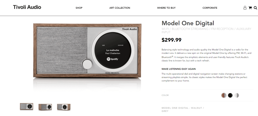
...and also action shots, such as this one:
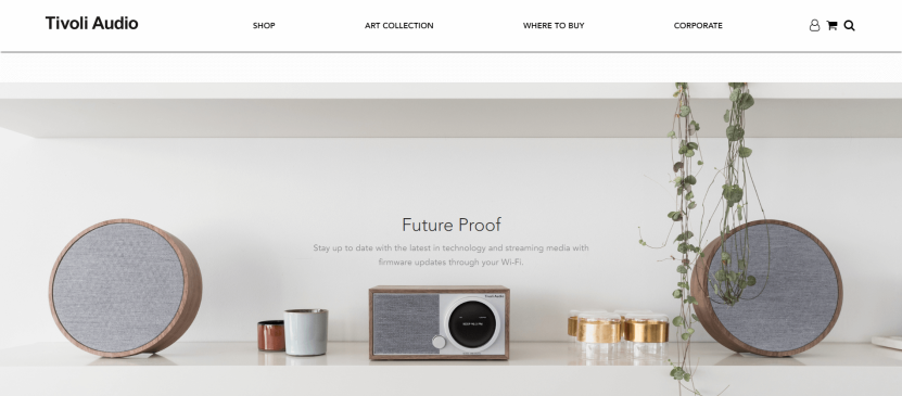
If necessary and/or possible, you might also decide to include 360° photography or video, as well. Or, as Winter also suggests, you might promote the creation of influencer-generated content in order to allow potential customers to see how others typically use your product.
Again, your goal is to do whatever you can to bring your products to life before your customer commits to opening their wallet - or they might not actually do so in the first place.
Recommended readings:
17. Lack of social proof
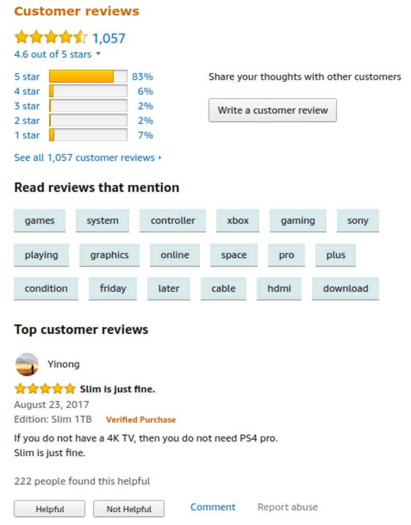
As you likely know, social proof - such as product reviews, testimonials, and referrals - are major drivers in terms of getting prospects to convert.
What better place to put this social proof, then, than on your actual product pages.
We’ve been using examples from relatively smaller eCommerce companies so far, but let’s take a page from the book of Amazon, here:
Simply put:
The more positive reviews you can generate, the better off you’ll be.
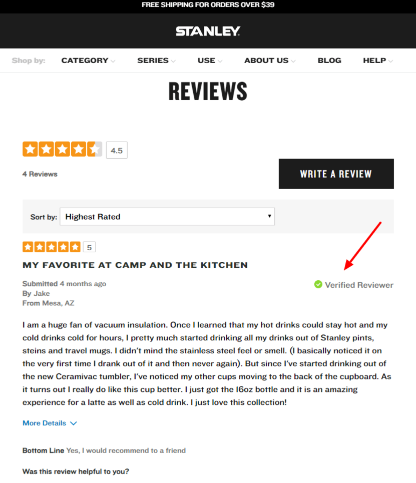
Just be sure that these reviews appear valid and authentic to your visitors, of course. The easiest way to do this is to add a “Verified Reviewer” badge - just like one of our clients, Stanley PMI:
Editor’s note: You can manage any product reviews on Coredna by going to Catalogues > Select one of the products > Feedback

18. Lack of service info
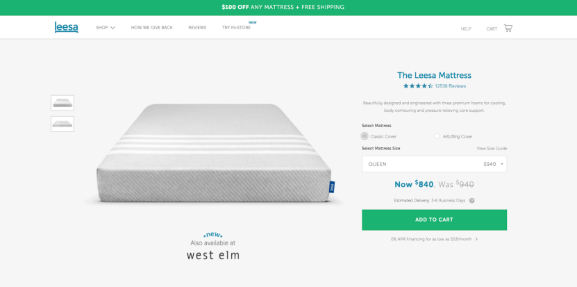
Rather than hiding information regarding delivery time and financing options on separate pages, Leesa gives its customers everything they need to know right upfront. In turn, the customer is just that much more informed as they move forward with their transaction.
Another service-related piece of info you might want to include on your product pages is your return policy. This will allow even your more hesitant customers to move forward with their purchase, knowing full well they can return or exchange their purchased product should the need arise.
19. Lack of security certifications
It’s no secret that even non-tech-savvy consumers have become pretty conscious of keeping their private data safe and secure when doing business over the internet.
As we spoke about earlier, ensuring the security of your eCommerce is essential for a variety of reasons.
(As a quick side note, eCommerce consultant Carl Hendy still finds that many online stores “still run without HTTPS, with only the checkout page being HTTPS.” This, of course, could be disastrous in the long run.)
At any rate, the point here is that you want to be doubly sure that your visitors know their information is secure when browsing around your site.
If your potential customers don’t see one or more of these when browsing your site:
...they almost certainly aren’t going to be giving you their personal information - or their business.
Mistakes related to the checkout process
20. No guest checkout
Andy Crestodina of Orbit Media Studios puts it out there plain and simple:
“(Not allowing guest checkout) is a critical flaw. There are dozens of little mistakes you can make in eCommerce, but nothing is more deadly than the ‘Create Account’ button.”
For one, forcing your visitors to register before making a purchase makes the transactional process just that much longer and more complicated. Secondly, it forces customers to commit to something they might not actually want to commit to (such as signing up for your mailing list, or being entered into certain sweepstakes). Finally, as we just spoke about, it forces them to provide more personal information than they may be comfortable providing.
Think of it like this: If you had to sign up for a store account every time you make a purchase at a physical location, how much less shopping would you do?
Yea...same here.
Recommended readings:
21. Surprise fees
We touched on this earlier, but it’s worth coming back to:
Unexpected fees are one of the top eCommerce conversion killers around.
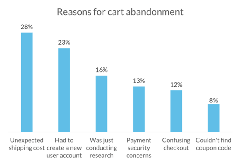
Whether it be tax, shipping fees, or - the worst of the bunch, in my opinion - the dreaded “convenience fee,” these additional costs can come out of nowhere and completely blind-side your potential customers. As the graph above shows, these unexpected fees will almost certainly drive away a decent amount of business.
Of course, this isn’t to say that your company should eat the cost of tax and shipping. Rather, we simply mean to say that you should provide all of this information well before your visitors reach the checkout page. At the very least, your customers will appreciate the upfront honesty; hiding these fees until the last moment, on the other hand, will come off as...well...kind of sleazy.
22. Lack of payment options
Along with the prevalence of eCommerce has come a variety of payment methods.
Needless to say, the days of “cash or credit” being a customer’s only options are long gone. Nowadays, there are dozens upon dozens of ways eCommerce consumers can pay for their orders.
While you don’t necessarily need to offer all of these options, your best bet is to do some digging into the preferred methods of your target customers, and focus on catering to as many of these expectations as you possibly can.
You don’t want to lose customers for the sole reason that they logistically can’t pay you.

23. Lack of delivery options
Similarly, you also don’t want to lose business because of a discrepancy between your method of delivery and your customer’s preferred method of receipt.
Of course, not all customers want the same thing in terms of delivery and fulfillment. Some want their package to be delivered as soon as possible, no matter the cost; others don’t mind waiting a few extra days, as long as shipping is free; still others want to have a say in when, where, and how their products are delivered.
Again, it’s nearly impossible to cater to all of your customers’ needs in this aspect. But you certainly want to provide a variety of options that a) incentivize conversions, and b) don’t cut into your profit margin.
Recommended reading:
Mistakes related to content marketing
24. Not investing in content marketing at all
One of the biggest mistakes many eCommerce companies make is assuming that content marketing is too difficult, isn’t all that effective, or simply isn’t “for them.”
While content marketing isn’t easy by any stretch, a proper approach to the strategy certainly can be incredibly effective.
Emil Kristensen of Sleeknote seconds this:
"Yes, content marketing is hard. And it's even harder for e-commerce. But that doesn't mean it can't work for you. In fact, Casper uses strategic content to answer their market's frequently asked questions. And it works like a charm."
No matter what industry you operate in, there will always be some sort of educational, informational, or otherwise valuable topic to write on and present to your customers. As we’ve touched on a few times throughout this article, the more informed and engaged your audience, the more likely they are to convert.
Recommended readings:
25. Too much content, not enough marketing
Now, while the audience-facing purpose of developing content is to inform and engage them, the company-facing purpose is to do so in order to get them to convert.
That said, if your content marketing initiatives are generating more and more visitors - but aren’t generating more and more conversions - you might as well not have created the content in the first place.
Of course, this doesn’t mean you should be creating “salesy” content (more on this in a moment). Rather, you should be focusing on creating content that nurtures prospects along their buyer’s journey, and primes them for conversion.
In other words, a prospect, upon engaging with a piece of your content, should be much more prepared to use your products than they were before they read, watched, or listened to your content in the first place.
26. Creating generic content
In order to create engaging content that your audience values, of course, this content needs to be highly-relevant to their needs and expectations.
Additionally, as we’ll dig a bit deeper into momentarily, it’s important to remember that content marketing is much more than just blog articles and social media posts.
That said, as Jeff Cox of SendinBlue claims:
“One of the biggest mistakes I see eCommerce businesses make time and time again is sending a generic newsletter with no segmentation whatsoever. The more targeted and relevant your content, the higher your engagement and conversion rates will be.”
Extrapolating this to your overall content marketing plan, it’s a huge mistake to focus on creating content you think your customers will find interesting, rather than what they actually find interesting. Basically, you could end up spending a ton of time, money, and energy creating content that no one will read.
Furthermore, creating content that appeals to a generalized audience - rather than a specific segment of your audience - isn’t exactly difficult to do. That being the case, many other companies have already done so, so your content isn’t likely to stick out all that much.
With that in mind, you’ll want to dig deep to create content that engages and educates your audience - and simply can’t be found anywhere else on the web.
Recommended readings:
27. Creating jargon-rich, complex content
On the other side of things, you want to keep in mind that, while you’re an expert in your niche, your target audience might not be.
Here’s James Stevens of Roses Only:
“(It’s a huge mistake to) complicate messaging and assume consumers understand industry jargon.”
Though you definitely do want to communicate a sense of expertise and knowledge through the content you create for your target customers, you don’t want your content to be so full of jargon that your novice audience members can’t understand anything you’re saying. Not only will this render the content useless in your reader’s eyes - but it will also make you appear a bit egotistical.
28. Doing too little - or too much
For those just diving into the world of content marketing, many assume “blogging” to be the be-all-end-all of the process.
But blogging is just one type of content, and should only be a part of your overall content marketing plan.
Among many, many other content types, there’s:
- Infographics
- Podcasts
- Webinars
- Ebooks
- Case Studies
- Newsletters
...the list goes on.

It’s important, then, to keep in mind that not everyone of your customers wants to (or has time to) read a blog post. Some might prefer listening to podcasts; others might enjoy long-form content such as ebooks and white papers.
Again, it comes down to knowing what your customers want, and focusing on creating these types of content.
On the other hand, you don’t want to spread yourself too thin by creating too many types of content. In the same way that determining the type of content your customers want can help you expand your horizons, it can also help you narrow your focus, as well.
29. Focusing on selling rather than providing value
As we touched on earlier, content marketing should be about:
- Educating and engaging your target audience
- Nurturing your target audience toward conversion
However, you never want to use this content to push a sale, by any means. The point of content marketing is to get your audience to make the next move on their own volition.
Not only that, but the modern consumer essentially expects blog posts and other such content to be presented without any sort of pressure to make a purchase (even if they aren’t exactly conscious of this fact). That said, the moment a piece of content becomes “salesly,” most consumers see right through it and quickly move on.
There’s certainly a time and place in which being overt with your sales pitches is acceptable; typically, content marketing is not one of these times.
Mistakes related to the business-end of things
30. Launching first, validating second
Let’s have Ashirwad Shetty of Specbee explain:
“(If you’re looking to launch first before marketing), you better have identified and enrolled a first set of beta users before store launch so you can validate your idea.”
What Shetty is also saying, here, is that launching an eCommerce business before validating your idea is essentially a recipe for disaster.
Shetty goes on to say that the preliminary procedures of running a business - such as developing an MVP, generating a buzz via social media, etc. - are incredibly important in the world of eCommerce.
As we said in the intro, creating an eCommerce business isn’t as simple as opening an online store and watching sales skyrocket. As is the case in all other businesses, if you’re not prepared for what’s to come, you aren’t going to make it very far.
31. Focusing on the wrong metrics
As Allen Burt of BlueStout explains:
“The #1 mistake I see eCommerce brands make is focusing too much on traffic and forgetting the other key ‘levers’ they have at their disposal to increase revenue. Too often, eCommerce managers focus all of their efforts on driving more traffic, when you can literally double your business by focusing on improving conversion rates and average order value first.”
You should always be focusing on improving the metrics that are most important to your bottom line. Sure, increasing the amount of unique visitors to your site leads to a higher potential for improving sales numbers, but, as Burt points out, there are much more efficient ways to improve revenues (while decreasing acquisition costs, as well).
The takeaway here is: Fix your leaking buckets FIRST before pouring more water into it.
Recommended readings:
32. Not defining your target audience
Along with what we just said, generating a buzz - whether before or after launching - is key to success in the world of eCommerce.
And it’s definitely not as simple as “if you build it, they will come.”
In other words, you can’t expect the right people to just “show up” at your website, just because you offer something they’ll find valuable.
Rather, you need to know who these individuals are before they even know you exist.
Still, this is a very common issue among eCommerce companies. As William Harris of Elumynt explains:
“I see people spend a lot of time and money developing their product, a lot of time and money working on their website...but they don't spend even one-tenth the time and money on figuring out exactly who their audience is. This is critical, because knowing your audience will help you figure out which images to use for ads, which words to use in descriptions, which social channels to aggressively maintain, and more.”
Raphael Paulin-Daigle of SplitBase echoes this sentiment:
“One of the most common and fatal eCommerce mistakes that I see people do all the time is not talking with their customers enough. Companies often think they know their customers inside out, but the truth is, most customer personas that companies create are built on demographic data and assumptions. The problem with this is, if you're trying to increase your eCommerce sales, you need more than that: You need to understand your customers on a deeper level.”
Simply put:
Without a clear idea of who your target audience is, you’re essentially going into every single initiative you dive into completely blind.
Recommended reading:
33. Not knowing how to reach your target audience
This goes along with what Harris said in the last section:
It’s not enough to know who your target customers are; you also need to know how to reach them best.
Think about it:
You’ve created a product that you know a certain group of people will find highly valuable. You’ve developed highly-relevant and valuable content to keep these individuals engaged, and to build their trust.
You’ve done all this...but you have no clue how to actually connect with them.
Are they on Facebook? Do they use Twitter? Do they care about email newsletters?
If you don’t have the answers to these questions, your products will end up being seen by nobody of importance...no matter how valuable they may be.
34. Pricing products based solely on the competition
Mert Gencler of Prisync believes one of the biggest mistakes eCommerce companies make is that they “track prices automatically, and don’t adjust their prices to their competitors’.”
Taking this a step further, putting your pricing strategies on autopilot can cause you to miss out on a ton of revenues over time. Furthermore, the best price isn’t just the one that undercuts the competition (I mean, it’s not how Rolex operates, and that company is doing just fine…).
While it’s beneficial to automate some parts of your pricing strategies (such as the collection of data, calculating revenue projections, etc.), you don’t want to be completely hands-off, here. The case may very well be that you could increase your prices and actually make more sales. Or, you may find out that offering a competitive price is what it will take to generate higher sales numbers.
At any rate, the takeaway here is that a proper pricing strategy isn’t exactly easy to nail down. That said, once you find the one that works best for your company, it will definitely be worth the effort.
Recommended readings:
35. Expanding or scaling before you’re ready
Michael Ugino of Sellbrite says the number one issue he deals with when working with small eCommerce companies is they often try to expand their business too quickly.
“We help brands and retailers expand their business to new sales channels, but often times the company isn’t prepared to make the leap. Every new channel is essentially a new business, and it requires planning and preparation of its own.”
Again, this goes beyond just what Ugino has to say about sales channels; it pertains to your entire business as a whole. Yes, business may be booming now, and your products may be flying off the virtual shelves; but overextending your company in any way - such as increasing wholesale orders, expanding your catalog, or investing in more expensive software - can cripple your business if you haven’t prepared for the move.
Your first order of business should be to prove that you can sustain - and steadily increase - revenues over a decent period of time. Once you’ve proven that you’ve “got something going,” you can begin looking at ways to scale that are manageable, and that won’t break the bank.
Recommended readings:
Guilty as charged?
Whew.
As we said in the intro, finding success in the world of eCommerce is not nearly as easy as it may seem - and approaching it as if it is easy will almost certainly lead to failure.
That said, understanding the common mistakes made by fledgling and experienced eCommerce owners alike is essential to your success as a business owner.
Not only does having this understanding allow you to anticipate and avoid making these same mistakes, but it also proves to you that making these mistakes doesn’t necessarily mean you’ve failed. That is, as long as you understand why you made the mistake, and how to go about fixing it, your business will continue to improve on a daily basis.


