The Hidden Cost of Poor Ecommerce User Experience

A slow-loading page or clunky checkout might be costing you more than you think. Here's how UX mistakes quietly erode your bottom line.
The discipline of user experience is broad, but ultimately has the goal of creating a digital experience (which may include online and offline journeys) that makes a consumer happy, or at least meets their expectations and doesn’t confuse or frustrate them.
Key takeaways
- UX is not just UI: User Experience (UX) goes beyond how a site looks—it’s about meeting user expectations and removing friction from their journey.
- Know your users: Avoid assumptions by using data, indirect and direct feedback to understand your audience and tailor experiences to their needs.
- Optimize mobile UX: Design for one-handed use, simplify tasks, use gestures wisely, and streamline processes like checkout to boost conversions.
- Focus on user journeys: Map and improve every step of the user’s path to purchase across devices to reduce drop-offs and increase sales.
On this page:
The importance of user experience in eCommerce
Achieving these goals is vital for generating online sales, as it will literally make or break a sale. According to Forrester Research, every $1 invested in UX can give a $100 return, and so it shows that a few informed changes to your online experience can help optimize conversion rate and provide an impressive return on investment.
Understanding your users: Assumptions won’t cut it
The very foundations of user experience are built upon knowing your users, and this means really understanding them. It doesn’t mean making assumptions or just having opinions on what they want, like or expect, but actually doing the research to provide the evidence that supports your understanding. How can you begin to design in a user-centric way if you don’t really know your customers?
Once you have the research, you can turn this into actionable insights to inform your web design decisions, and that isn’t just the colors and images to use, but the processes and interactions that need refining to solve the conversion problems.
3 user research methods to get into the minds of your website visitors
There are different ways to gain insights into your customers.
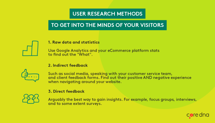
1. Raw data and statistics
Google analytics and your eCommerce platform stats can tell you ‘what’ is happening, such as where people are dropping out or which pages are least popular, but it is through listening to your consumers that you can uncover ‘why’ things are happening.
2. Indirect feedback methods
Social media listening, speaking with the customer service team and reviewing client feedback forms, can all provide interesting findings, although often these sources reflect the thoughts of customers who feel particularly positive or negative about their experience.
3. Direct feedback
Arguably the more valuable insight can come from those people who had an experience that was just ‘meh’, not particularly bad, but not good enough to make them want to part with their cash and buy. This insight can be gathered through focus groups, interviews, observations and to some extent surveys.
What are user personas (and what’s their role in UX design)?
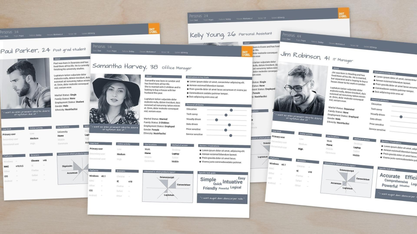
UX personas are fictional representations of your actual website users and will often include their needs, interests, goals of their website visit, their attitudes, motivations, expectations and technical ability.
User Personas are created by the research and insight gathered by speaking with your users directly as mentioned above, including those who buy from you and those that don’t. The first step is to identify who your different ‘user types’ are. The personas are used to test different relevant online journeys from the mindset of the different user types (rather than through the eyes of a designer, developer or marketer).
Personas are used to help teams make decisions whilst thinking in the mindset of different consumers. They help marketers, UX professionals, designers, and developers to understand what users are thinking and feeling. This helps in order to better meet their customers’ needs with a more optimized experience.
How user journeys affect conversion

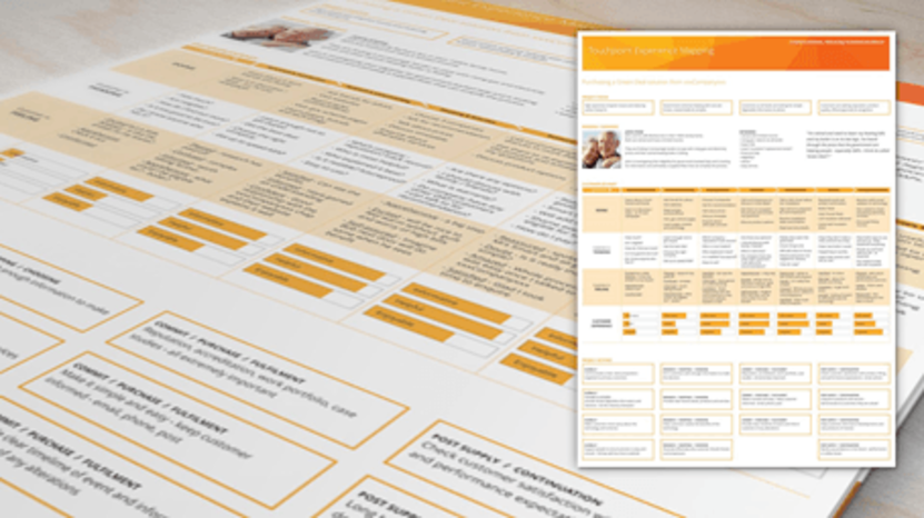
User journeys are the paths that people take to reach their goal. A goal might be to purchase home insurance, a camera or a holiday. A consumer will go through a number of steps (known as ‘Tasks’) to achieve their end goal, this may include brand and/or product research, customer reviews and price comparisons. It is likely that these tasks don’t all take place in one session or on a single device.
Here is a visualization of a simplified user journey where a consumer wants to buy a new camera, on their mobile phone whilst on the train.
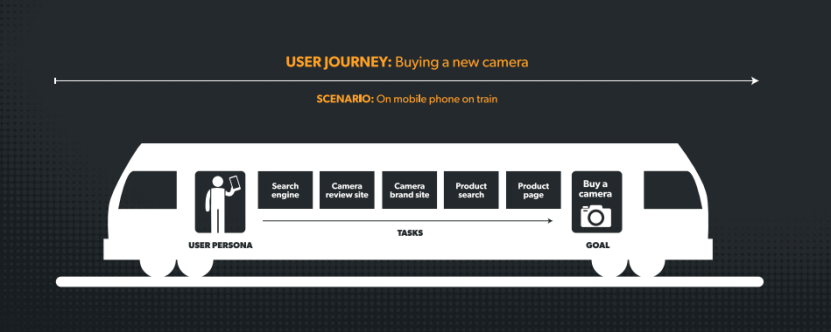
By mapping out the different user journeys in the different context (or ‘Scenarios) in which they take place, means that you can identify opportunities to optimize the experience and make it easier for the consumer to reach their goal when they are ready.
In reality, the journey will likely be more complex, crossing multiple channels and devices.
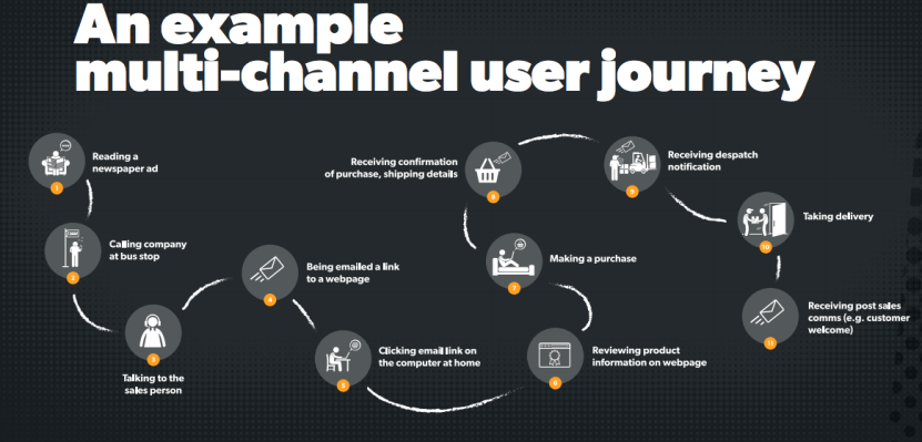
All too often consumers are faced with obstacles and barriers to completing their online journey resulting in a lost sale for your business. Whether it is too many steps in a process, a forgotten password, confusion on what to do next or distractions from too many messages, refining the online journey to optimize the user experience can directly reap conversion rewards for eCommerce websites.
There are a number of techniques that can be applied to help optimize an online journey, but it’s important to realize that what works for some websites, won’t work for others, and that is purely because of the consumers. Simply applying ‘best practice’ UX changes won’t guarantee an increase in conversion and certainly won’t unlock the potential in your own online experience.
Designing the user journey for mobile
While some businesses might believe that their website is great and doesn’t need changing, they are forgetting that users expectations continue to evolve. With every new impressive mobile interaction a user has, they’ll demand more from each digital presence they encounter.
Yet, despite this increasing pressure, companies are still failing to deliver a great mobile user experience, and as a result, they are suffering the costs, according to Google 50% of users abandon mobile transactions because of a poor experience. 61% say if they can’t find what they are looking for immediately on a mobile site they will quickly move to another site, and 40% will visit a competitor site. This consumer demand combined with the introduction of mobile-first indexing by Google demonstrates the need to deliver an optimal mobile user experience in order to optimize conversion.
How to improve eCommerce UX to boost mobile conversions
To improve your online conversion rate, getting the online user experience right on mobile is vital, so here are a few ideas that should be considered in the context of your users and their goals.

[Tip #1] Design for the “one-thumb” user
![Image. [Tip #1] Design for the “one-thumb” user](/files/images/blogs/71/943/mobile-ux-1%282%29.webp?f=png&w=831&h=583)
The majority of people (85%) use their smartphone with one hand and for the 75% of thumb-only users, the size of larger mobile screens means that the amount of content within easy reach is reducing, so remember to keep key actions within easy reach when designing the interface. This also leads to inaccurate tapping, so avoid putting irreversible actions like ‘empty basket’ in areas where it could be accidentally selected.
[Tip #2] Make it easy
People don’t like thinking too hard, and as they use their mobile in short bursts, it is even more important to make it easy for consumers to interact with your site. With these insights, you can identify the important actions that users need and want to undertake, and you can drill down to identify how to simplify these as much as possible.
Using the right keyboard inputs, for example, numerical for credit card details, reducing input fields to the bare minimum, chunking down lengthy forms into manageable amounts, using smart defaults and previous input data can all help speed up and simplify tasks which require mental and physical effort.
Here is an example from Luke Wroblewski, Product Director at Google, whereby stationery store Staples in the US reduced their online checkout process from 22 fields to just 5.
![Image. [Tip #2] Make it easy](/files/images/blogs/71/943/mobile-ux-2.webp?f=png&w=831&h=478)
[Tip #3] Gesture control
![Image. [Tip #3] Gesture control](/files/images/blogs/71/943/mobile-ux-3.webp?f=jpg&w=831&h=430)
Tinder used gesture control as a key part of their online experience and taught the world what it meant to swipe right. Fluid gestures like hold, swipe, drag and pinch are some of the gesture actions that can be used instead of tapping and typing. However, with no universally accepted or consistent standards on using gestures, they should be applied with caution. If tapping or swiping doesn’t result in the outcome that a user expects, then your site will fail. You need to educate your users what the gestures achieve on your site and keep it simple to start with.
[Tip #4] Streamline processes
![Image. [Tip #4] Streamline processes](/files/images/blogs/71/943/mobile-ux-4.webp?f=png&w=831&h=526)
There are a number of common processes or ‘workflows’ that you might expect users to undertake on your mobile site, from account registration to content download, completing a contact form to making a purchase.
There are certain actions that consistently frustrate users, such as ‘signing up’ and ‘logging in’. Research shows that over half of users will quit rather than doing yet another site registration and 92% will give up if they forget a username. 82% of people forget their passwords and the 75% of people who recover a password won’t complete the checkout process. Similarly, long checkouts are one of the leading causes of abandonment. Providing the option of a guest checkout can boost usage by 30-40%.
It might mean that to create the best experience for your users you need to create a bespoke solution outside of the typical, off the shelf checkout platforms.
When you are designing for conversion rate optimization on mobile, you need to scrutinize all user processes in order to refine them as much as possible. You might also consider linking a website registration process to a Google or iCloud account to enable cross-device synchronization for a more seamless journey. This will enable users to continue their journey even when they switch device. For example, they may start a product search on their mobile and continue it seamlessly when they switch to desktop, allowing for a smooth buying lifecycle.
Focus on eCommerce UX, and the conversions will come
If the user experience design of your eCommerce site doesn’t meet the needs and expectations of your customers, it will directly affect your conversion rate. The good news is that by understanding your user types and optimizing your website for the goals they have and the journeys they undertake, you will quickly find that you are rewarded for your efforts.
To optimize your conversion rate, you need to dig into the details, uncover the qualitative research and insights directly from consumer to make the informed onsite changes that will make the difference.


